


Neue Aktivität
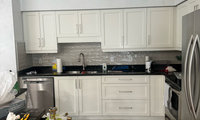


I like the second photo better, but keep in mind that online color never looks like it will in real life. Post a photo of the actual floor and the actual butcher block wood you are considering. And remember that only you can tell what it's going to look like in your room.
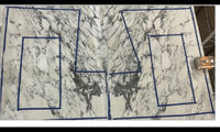

Absolutely beautiful stone! It’s a shame to cut out so much of it. To me, the center bookmatched area looks like a butterfly! My point of view…a potfiller will interfere with the asthetics of the spectacular backsplash.
Well, considering the stone is cut and ready to install, no. I was just asking for feedback on a pot filler or no given the stone I am using. Thank you to all whose feedback was helpful. I will not be installing a pot filler.

No pot filler. They break up the look of any stone behind your stove. Their usefulness is questionable to me, but my sink is directly opposite my cooktop, so it’s not difficult to move a pot of water.
I think it’s an example of the kitchen industry creating more unnecessary design items so keep us remodeling. Having worked in the refacing area in its infancy, I think large visual upgrades (cabinet colors and countertops) make the most impact. And make for the happiest homeowners.


Where is the gold orb lamp from with beige shade?

I know this an old post but wow your canvas is fantastic.

I enjoyed a similar color as Not a Cloud in sight as my living room, hall and dining room color. But it was a Dunn Edward’s brand. I enjoyed the splash of color. The painter thought I was crazy but I was very happy! Then after my happy stage for many years, Ive come into my neutral stage. But my dining is a similar color to the Sea Glass, Glass Slipper. Once upon a time a family room was periwinkle color and my female friends loved it. The good thing about paint is that you can do it, enjoy it and then play with other colors a few years later.
Im currently enjoying Lace Veil by Sherman Williams. Its a light cool gray that’s neutral and makes my house bright and clean. All my ceilings and wood trim are white. I add my own blue colors (still a blue fan!) in my linens, sofa pillows and accents. Im happy!
Sheetereindesighn, your room looks wonderfully nappable!
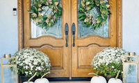

I am usually so tired of our Texas heat, that I am ready to decorate for fall. I don't decorate as much as I used to, but I do change out accessories on my mantel, dining tables, and entry hall. I love all the pretty whites above, but I stick with traditional fall colors.
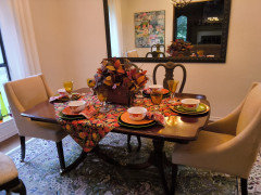
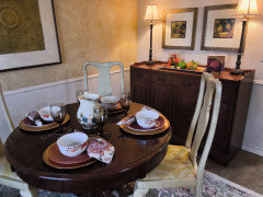

I also like to add some whimsy, so I switch out a small framed art in my coastal themed guest bedroom seasonally.
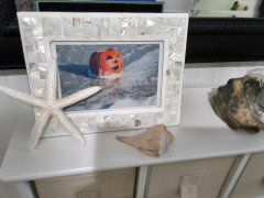
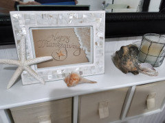

Melinda, I’m tired of our SoCal heat, too!🥵 Cooling down with rain this weekend.👍🏻
I bought all my pumpkins and even have some that lasted from last fall. The yellow-ish “Blaze” one here is one of several from last October, along with the green one in the second pic. Love me some pumpkins.😊



I’ve posted these before…some whimsy for fall/Halloween.

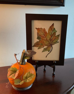



Gls. We are so happy you came away from this storm safely. I was getting quite concerned.

Thank you Flo!♥️


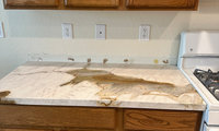
I agree with @freedomplace1 - use a wipeable paint for the backsplash wall. It allows you to find the exact shade of white-ivory that is in the background of the stone.
Don’t try for a color. The countertop declared itself the center of attention, so don’t fight it. It’s stunning.
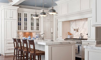
Love this whole look! What is the material used in counter? Also the colour of the ceiling. TIA
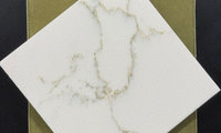

not a pro but I really think the two toned cabinets would be a lot for a really small kitchen
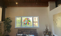

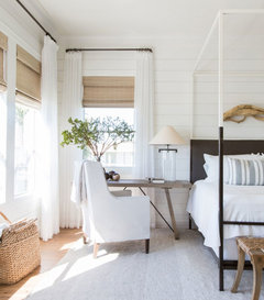
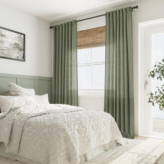
I agree with the woven shades and drapery panel solution.
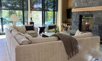
I would not feel obliged to fill that space: the dark, textured stone is already a strong feature, while the TV occupies the quieter recess to the left. If the wall still feels bare when you sit on the sofa, I would try one wide, softly colored artwork centered over the mantel—something with an ivory or warm taupe ground and a little charcoal to connect it to the stone. I would skip a grid of small frames or a mirror, which could compete with the stone pattern and reflect the windows or TV.
Before buying or drilling, tape up a paper rectangle to judge the scale from your usual seats. If this is a working fireplace, check the unit’s heat-clearance guidance and the mounting method for that stone first. Leaving the stone bare and styling the mantel simply is also a good option.


Don't tell Kentucky Derby participants or other millionaires who favor this design. Who are you? Agree with Brandi. Tacky comment.

Beverly, if you had just called it "tacky", I might have thought you were just having a bit of fun. ( bridles, saddles, bits = tack ) But since you said "kitschy and tacky", it does just come across as rude and condescending.

Plantation shutters are a good choice for windows such as yours.
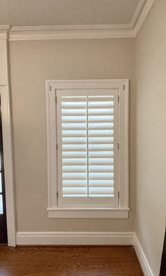
Plantation shutters can be angled and work amazingly well. So easy to maintain.
I waited a year after remodeling a kitchen, and a lot of other rooms, in my former home. I found my patience was higher when I gave the kitchen - and myself - a break. You can use paint for now and see what new tiles come into the showrooms over the next year.
I have had luck with Tilebar. They send 5 samples for $5 and have a huge inventory of neutrals. Looking at your photos, the one on the right - the creamier one - looks better. I would entertain “light beige” when searching since “ivory” may not get you a creamy color.
My favorite budget-friendly changes from this mockup are:
1. Crown molding painted to match the cabinets, extending the cabinetry visually toward the ceiling.
2. Brushed brass hardware for warmth and an elegant finish.
3. Light countertops in a warm white with subtle beige veining.
4. Lighter flooring in a natural oak or warm beige tone.
5. Under-cabinet lighting to brighten the backsplash and make the kitchen feel more expensive.
Start with the crown molding and hardware. Those two changes can make a surprisingly big difference before you invest in new countertops and flooring. And keep the cabinet color warm rather than stark white—it will work beautifully with your future natural stone-look surfaces.
Just an FYI: A friend of mine, who owns a 1929 Dutch Colonial, installed a classic black and white floor in her kitchen when she initially added it onto the back of her house. Ten years later she pulled them up and extended the wood floors into the kitchen because she found it very hard to keep the white parts clean. Choose your product wisely. Ease of maintenance is a biggie.
I’m not saying all black and white floors are hard to keep clean, but know what you’re getting and the expected upkeep.