


Neue Aktivität

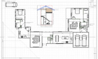

I would never buy a large, higher end house with mini-splits ... wall warts.
Fine if you are remodeling and that is the easiest way to get hvac to a room, but it should not be the default for new higher end construction.
You can use the same technology with flush ceiling or flush wall mounted units that are standalone or ducted to units in the attic. They are called VRF hvac system.
You still need ducts for return air if you are doing a properly designed VRF hvac system. Humidity control should also be designed into the system.

Many of the rooms are too small. The furniture isn't to scale, so things look like they fit. To make it worse, most of the rooms are part of the circulation pattern to other rooms, so they are functionally smaller than they look.
You live in Zone 3, yet have no place at the garage entry to keep a coat or a pair of boots? We're a household of 3, and in the winter we fill the closet by the garage, and keep extra coats in the closet by the front door! And no basement?
Where I live, the frost line goes down at least 4'. Since our foundations have to go down that deep (or more, most folks put in a basement, since it doesn't take significant effort to dig a bit deeper. This is also why split entry homes are popular here, since the lower level is around that 4' mark.
What will your foundation be like?
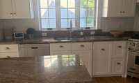

I think it should just be things you enjoy - perhaps a rosemary topiarary, or an orchid from Trader Joes? Texture can be nice with all the hard surfaces and things with age & patina can add interest
fwiw I love dried flowers and pods (or weeds as dh calls them), small vintage containers, shells from a beach trip, a small ceramic heart from when my labs passed away etc.. just got an incredible little ironstone pitcher from goodwill recently for $5 😍
i keep my soap in the sink to keep the counter dry
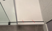
These "new" sliding doors always leak some water when taking a shower. They look cool, but the design just isn't water tight. At least you have a bit of a threshold so you don't get water just flowing out the bottom.
Get used to putting a towel down to catch the water.

I'd pay attention to how the shower is pointing while showering, particularly the handheld part. Can you change the angle of the shower slightly to minimize the problem?
Phillip Jeffries - Flight - with or without the birds
https://www.phillipjeffries.com/shop/CARD-GAL-FLIGHT/7062
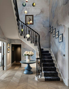
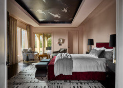
Cole and Son - Nuvolette by Fornasetti.


I love the idea of clouds! But you need to take into account how much of a curve there is in the ceiling, and how that might complicate installation. Talk to your wallpaper hanger for advice.
Thank you everyone. I appreciate the advice!
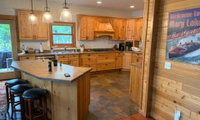

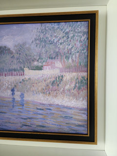
Personally, I don't think that MSI Carrara Breve quartz is a good option. You have knotty pine + real slate floors = cozy lakeside cabin (I assume lakeside based upon the photo on the wall).
Your multicolored slate flooring has rich earthy tones (rusts, charcoals, and deep grays) that perfectly mirror the natural, rustic appearance of soapstone. Soapstone's deep charcoal tone will help anchor the room - it will pull in the darker shades that are in the slate floor. Soapstone (a natural stone) fits with the architecture of the space vs. fighting it.
MSI Carrara Breve's white background (it may be a warm white - but it still looks pretty white in the photos I've seen) + its delicate faux-marble veining are designed for contemporary or transitional urban/suburban kitchens. Next to the heavy, warm, dominant wood grain of knotty pine, a white faux marble quartz will look "plastic" and artificially bright. It seems like it will disrupt the home's organic, cozy aesthetic.
Here is a photo of a Houzz user's kitchen with Carrara Breve quartz .- her cabinets are painted BM Simply White + she has a walnut island.
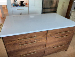
You could also use a leathered black granite - slabs like Absolute Black, Black Mist, or Negresco in a leathered finish will provide a deep charcoal-to-black color with a subtle, dimpled texture. It mimics the organic, historic feel of soapstone. You could also go with a honed finish if you don't want a leathered one.
Podcaster ... says it all.
I feel like I am reminded regularly how vapid so many people in "society" are. And I think it's because they feel like they don't have to try very hard to have a personality.

F Scott Fitzgerald addressed that very thing, Pal, in many of his stories.
This passage from his story Winter Dreams is very apropos to your comment @Lisaam:
”He knew the sort of men they were — the men who when he first went to college had entered from the great prep schools with graceful clothes and the deep tan of healthy summers. He had seen that, in one sense, he was better than these men. He was newer and stronger. Yet in acknowledging to himself that he wished his children to be like them he was admitting that he was but the rough, strong stuff from which they eternally sprang.”
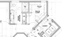
The master bathroom seems a bit small for that size house and the shower is definitely too small. One tub in the house is fine. Most people want a larger shower.
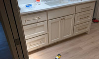
Leave it blank.
This is why I like to do full height doors for the sink cabinets.
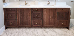
I too like full height doors there but it really is just to each his own, no rule .
No.
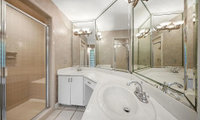
I would gut them all, but it doesn't have to be done right away if the bathrooms aren't leaking or full of mold.
I remodeled the 5 bathrooms in my previous house, but lived in the house for 3 years before I started planning the master bath project and completed it a year later. I then did a bathroom (or two) every other year and the kitchen at year 8. The whole house was remodeled/updated over ten years, but we bought knowing we would be spending that money to update.
@Patricia Colwell Thanks for your response. We like the glass block. We are working with the seller to replace the roof and a few other structure issues before working on major interior projeccts. Before moving in, we would like to get rid of popcorn ceilings, replace light fixtures, and get new window treatments. The interior has a fresh coat of paint and new appliances. We will take on larger projects in time. Thanks again.

You mention a potential mini-makeover on a limited budget and now have an 8 day period to decide on buying….were the bathrooms the only thing holding your back or are you moving forward no matter what (sounds like you are based on your last post). That resolves the time restraint pressure.
Suggest holding off/saving up to update bathrooms. You’ll also have a better sense of what you want and need.

If you have floor space in the room, could you build out the soffit to the floor and then move the vanity and mirror forward to your new full height wall?
I like the minimal frame approach, I’d also mount a height adjustable mirror to the side for more flexibility
*showing this one for concept, not sure this is high quality


the W/D is out into the room, Build out the wall and reinstall the vanity so it works for everyone... I'd personally build out the whole wall with a solid surface countertop and an undermount sink so you can use it as a laundry folding counter and a hand wash clothing laundry sink as well. add storage above as needed, shelves or closed cabinets.
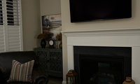
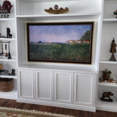
A Samsung Frame TV with a DecoTV frame would add some detail to the plain look of a standard TV, specially when you have the black hole effect.
This is my 75" Frame TV with a 3" DecoTV frame.
Love the clean lines of your fireplace - i’d only have one lantern so it looks a bit less staged but thats just a me thing
I love decorating my mantle for the seasons, but -- with the TV where it is -- I don't think it's a great option for you. No one likes to watch TV with floral stems sticking up over the edges of the screen.
I do like the idea of framing the TV -- it'll make it a bit more polished /more like art /less like a TV.
In answer to your question, I agree with the person above who suggested placing a small flameless candle on each edge and calling it a day.

"Hard to believe this was done by an architect."
Someone has to graduate at the bottom of the class in a lower tier program!

" This was signed off on by the city engineer "
What city actually has engineers who sign off on projects? I would not think a municipality would want the liability.

"This was signed off on by the city engineer"
Probably the drawings were signed off by the plan reviewer, which does not mean much.
Beams that terminate over a window or door will require a header above the opening large enough to carry half the load that beam carries.
The beam shown in New Bedroom 1 has a point load in the wall between the bedroom and bathroom. That point load does not appear on the first floor plan and probably same in the basement.
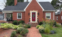

Gutters match fascia. Downspouts blend with the wall.
You are doing a custom glass shower enclosure, so I wouldn't be doing what is "standard".
My showerhead is at 82" and my glass it at 91" (with 10 ft ceilings).
Always above the showerhead and proportional to your ceiling height.
Do what looks good/balanced in your space and not what the average spec builder is doing ... they do the minimum to keep their costs down and profits up!

You do not need the glass to hide the shower head. A head sitting an inch or two above the glass is normal and often looks better than a door that stops in a random place.
72 inches is a stock height. It contains most splash for average users. If your head is at 84 inches, a 72-inch door will leave a clear band of tile and the fixture in view. That is fine if the tile line is clean. It looks unfinished if the glass dies in the middle of a field of tile with no cap.
84 inches can look more custom, but check three things first:
• Hinge and glass weight. Taller frameless panels are heavier. The hardware has to be rated for that panel, and the wall backing has to be solid.
• Steam and ventilation. A door that stops below the head lets steam out the top, which helps the room if you have a good fan. A door that goes to the ceiling traps more steam.
• A line to land on. Align the top of the glass with a tile course, a accent band, a window head, or a few inches below the ceiling. Matching the shower head exactly is less important than hitting a horizontal line.
Many remodels land in the 76–80 inch range as a compromise: more containment than 72, less glass and cost than a full-height enclosure.
If this bathroom remodel is in Titusville, FL or surrounding communities, The Handyman Titusville handles bathroom remodels, including showers, tile, and plumbing.
The Handyman Titusville
Titusville, FL and surrounding communities
321-621-0992
https://www.thehandymantitusville.com
you're going to see the shower head no matter what.
The water will splash off your head and out of the shower if it isn't tall enough.
... had a neighbor install a rainhead and slipped on the wet tile when she got out of the shower, didn't realize standing under the head could spray so much water. Live and learn.
Here are some examples from Houzz Photos
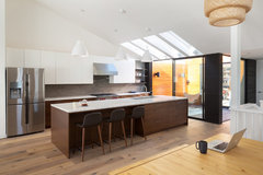
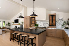
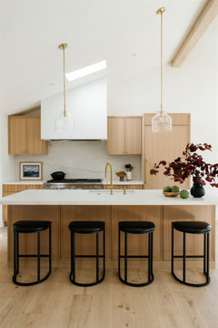
Thanks so much- it has been hard to find a photo likethis - much appreciated
And most of us here aren't clicking on links and downloading apps from random strangers!

All sounds doable Michelle! A true counter depth fridge would be a game changer to the space. And, since you are redoing the floor - you could eliminate the wing wall to the right of the fridge and do a cabinet enclosure - would gain you a few inches on the working side.

Since you're trying to get your thoughts organized before talking to a designer, I wouldn't worry about producing a finished kitchen design yet. Start with accurate wall measurements, windows and doors, and the existing sink/range locations, then work out a basic cabinet layout.
IKEA's planner can certainly help visualize one option, but I'd also keep track of the actual cabinet list separately. That makes it much easier later to compare IKEA, another cabinet retailer, or a local cabinet shop using roughly the same layout instead of comparing completely different designs and prices.
Without a starting cabinet plan, every seller may quote a different layout with a different cabinet list , making it hard to tell why one quote costs more than another. Unless you have a starting layout, cabinet list, and cost comparison before those conversations begin.
Your point about AI is important too, for this stage I'd rather work from actual measurements than an image that looks convincing but may not be dimensionally realistic.
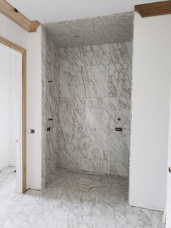
In my master shower I have 30"x30" porcelain tiles. In my guest bathrooms, one has 12x24 and the other 24"x24". I wasn't going to show a photo because with matching grout and shower glass in place, it makes it hard to see the individual tiles, but I found a good photo during construction, before it was grouted. I also like to tile the ceilings in all my showers.
This is 30"x30" wall tile. Shower is 48"x96" with 10ft ceilings.
Floor tile is 24"x24"
I would have gone with bigger tile, but this was the largest size offered in this tile collection.

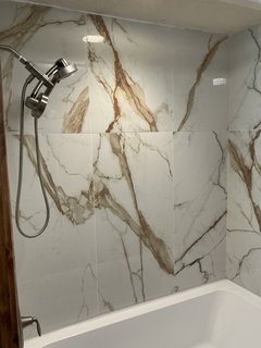
This is ours , though, it is in a tub/shower combo. 24x48 but the top row, had to be cut..
Thanks @dani_m08 that is super helpful information. I remember when I was considering LVP, trying to find out how many different patterns a given type, but it was hard to find out.
@Love stone homes thanks for the photo--very helpful as well.
Florida ... season is coming and most towns/cities have art/craft shows every month that are worth visiting. You can buy original art right from the artist.

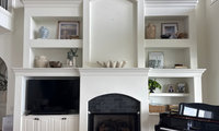
I have always been told that you should decorate shelves in a zig-zag . So the vases should be on opposite sides, books of varying stacks, etc.

That central niche would be a great place for a large and vertically oriented piece of art.
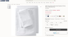
I've replaced most of my sheets with these from Land End. Very well rated. My Mom just got some too, and really likes them. First saw them recommended on the decorating forum.
They come in split-king and every other size. Many colors too.

What is your budget for bedding? I've seen some beautiful bedding on West Elm recently but it's a bit pricey.
Sorry, I’m not much help re color, that’s personal, but just chiming in to say I’ve had great experience with RH bedding. Yes, it’s pricey, but they usually have some on sale for about 50% off, think some are on sale now. We buy the quilts or coverlets.


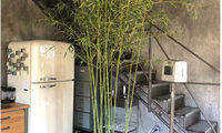
Definitely unique. Mostly positive reviews, specially about the location.

Interesting place, some very quirky stuff. Very industrial, do not mind yjis in the main areas, but the bedrooms are too cold for me. Agree that it is always nice to have a garden.

The bedrooms look like penitentiary chic. I don't mind the paper towel holder suspended like that...out of the way and easy to reach. The odd thing by the refer is replaced in some pics by a floor lamp. Are the stair treads pick up truck bed metal? Ouch!
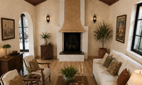
Feng shui of ceiling beams! 😂
I love my ceiling boxed beams and they bring us nothing but joy, happiness and elevate our mood and prosperity in every room! LOL

it's painted now, so it's essentially a color change. that's the good news.
rule of thumb in terms of psychophysical color strategy is the ceiling should be lighter than the floor. e.g. dirt is darker than blue sky.
a darker ceiling 'on top of' a lighter wood floor can feel upside down, off, heavy for some people. it's a choice that needs careful consideration.

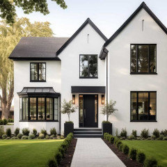
Sort of does not help. The window maker is who you ask about trim for your situation IMO If you want help here post pics of all the choices since you do not show the one you want. IMO the simpler the better since you are simplifying the exterior .This would be my choice
Funny they gave us this test in high school as part of college/career guidance. I think my results must have been similar, because back then it suggested accounting as a good college/career path. Of course at the time I looked at the test as psychobabble and who would want to do boring accounting! In hindsight, I would probably have made a good CPA/forensic accountant!

Oly, it says you are retired and very happy about that! 😆
Agree that many of the answers can go either way depending on the situation. That said I go back and forth between an INFP and INFJ. I did take the really long test during the hiring process for a job many years ago, can not remember which INF I was that day. I do find personality types interesting.
I can't help myself.... but have you thought about Queen of Spain from Schumacher?
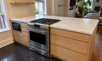
Make sure whatever MW or drawer you put against the wall will clear your trim when opened. You might have to make the filler a bit wider on that side. Wouldn't be the first time that trim on door or windows was not accounted for and you end up with drawers that can't be opened all the way.
In my experience the best place for a MW is on the counter. they do not last forever I can bet the next time you will not find one that fits that space.. IMO a 7" size cabinet is useless so as wide as possible on that side and get organizers for inside the drawers instead of sily little useless drawers.
I have a 12" 4-drawer stack to the right of my stove. The top two drawers have utensils for the stove. The third drawer holds DH's collection of spice rubs that aren't in the everyday spice rack. The bottom drawer holds the hand mixer, immersion blender and the thermometer gizmo for the outdoor grill.
I don't have organizers for the utensil drawers. They're too small, and a little jumble doesn't bother me.
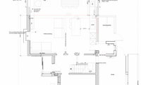
On the left and make sure they also stack on the left side, so they should open right to left.
" Vaxuum insulated glass is better insulation than triple pane. "
At what cost? Vacuum insulated glass is super expensive still now today and very few actually offer it. While great theoretically it really is still not ready for primetime.
The OP is not in the US.
Panasonic Glanevir is available through 2400 trained installers with government subsidies to upgrade single pane common in Japan. Panasonic uses precision machinery idled when they discontinued plasma tv production. This allows flatter tempered glass production. Better for the higher performing soft 366 radiant reflective coating. They offer annealed versions for windows with no sun exposure at a lower cost. They are actively ;incensing their tech and partnering to produce vig in Europe.
Know the price then decide your priorities.
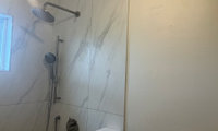
Maybe SW Snowbound for wall and cabinet or SW Snowbound for walls and BM Chantilly Lace for the cabinet.
For me, I think it would be hard to find a white that jibed with the tile and the White Dove that i would like for a wall color (sometimes white walls feel like primer to me) so i agree with @Patricia Colwell - I’d go for a knocked back pale green or blue

Hello everyone, I wanted to thank you all for your comments. I appreciate them all, and what I found really helpful was to not focus so much on the cabinets. I struggled a lot with this decision and went through a lot of samples, but in the end we went with White Heron on the walls and we love it. It’s a creamy white, bright but not overhelming and does not clash with the White Dove cabinets or with the Carrara tile.
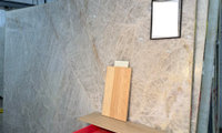
Thermal shock is real. Why play Russian roulette with your counters?
Just use trivets.

"33% of resin? Lordy, which brand has that amount of resin?"
Virtually all of them.
OK, I'm a nerd, so I had to do some math.
I found the following densities:
Quartz countertop: 2.4 g/cc
Quartz mineral: 2.65 g/cc
A 1000g sample of quartz countertop will have a volume of 416.7 cc.
Assuming the sample is 92% mineral by weight, the volume of mineral in the sample is 347 cc.
Therefore, the mineral content of the countertop is 83% by volume (17% resin).
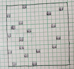
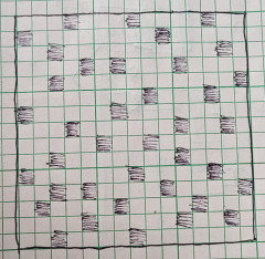
And then, because I'm a visual person, I filled in first 8% of the squares, then 17% of the squares. Clearly it makes a difference whether we're talking about percentage by weight (8%) or percentage by volume (17%).
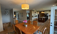
AI does what it wants to do!!
I didn’t prompt it to change the flooring or rugs.
" But they arent going to be completely accurate at this point "
But they would help more than the decsciption alone. Make some notes on the cfloor pland of what chnaged. Sketch them in.
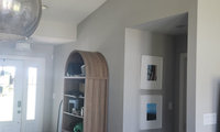
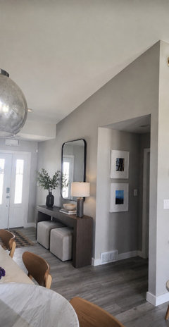
Yes, add a console with mirror. Add stools underneath if you need a place to sit to slip on shoes.

For me the stamped metal ones always look flat.
I like a composite type that can have layers applied to look more 3-dimensional and more like an actual wood product.
These are my composite doors. Mine are painted, but they sell wood-look versions, which are more expensive.
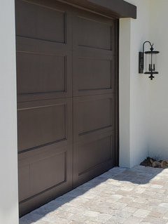
What is your climate?
We used real wood garage doors when we remolded our previous house in LA. The LA climate is very forgiving with real wood doors, if you do some light maintenance roughly every 5 years.
The garage doors matched the wood front door that was existing when we bought.
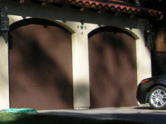
When we bought the house it had cheap flat brown painted garage doors. The wood garage door changed the whole look of the front facade.
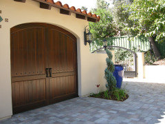
Original garage doors ... we also got rid of the asphalt and replaced with pavers.
When your garage doors face the front, they should look as good as the rest of your front facade.
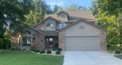
I like Emily's second example (the darker grey-brown) -- it manages to marry the mis-match between the grey roof and the warm brick. When you're due for a roof, go with shingles that go with the brick.
The old roof looked better than the new.
The house is a bit blah. The siding and trim colors could better match the brick and you might consider darker fascia to help stop the eye from wondering up to the roof.
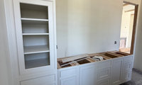
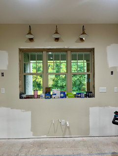
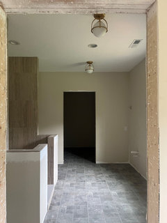
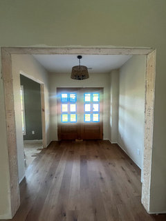
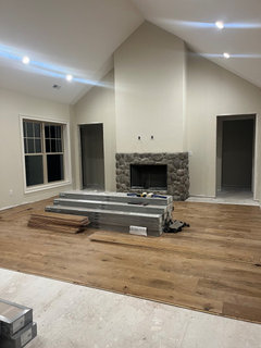
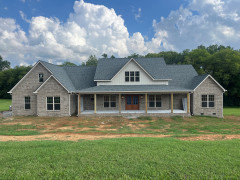
We're moving along fairly well still. Continuing to work on installing light fixtures and lining up subs. Our interior trim has begun as well as hardwood floors. Our gutters were installed last week, but in the wrong color, to be corrected. Aiming for cabinet installation late this week, then counter measure. As soon as the gutters are corrected we'll have final grade done, then driveway & sidewalk. We're likely going to list our current house this week. DOM in our zip code is 43 days.
This is our kitchen window. It overlooks our rear covered porch and back yard. Behind the wood line is a small creek on our property.
Master bathroom and closet.
Foyer with lighting and hardwood installed. Door has been stained.
Flooring going in. Ordering the mantle soon.
Front porch posts were installed. They will be painted the same color as the siding.

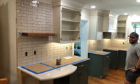
@Joy M since your home still has a lot of interior finishes to install I would recommend covering the light fixtures (as long as LED bulbs are used) and try to keep them powered off. The finished floors can collect grit that gets ground in by construction traffic, so I'd recommend vacuuming the entire house then protecting the finished floors with heavy construction paper or "red rosin" paper using blue tape, even if only a "pathway'. You may have to vacuum weekly. Change out HVAC filters as needed. Sometimes that's weekly.
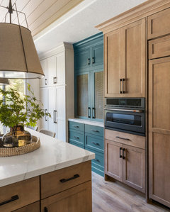
Your crown is a problem for me. Crown attached to cabinets should be the same color as the cabinets or you end up with a racing stripe across the top of the cabinets.
Here is an example of crown in same color as cabinets and it meets the white ceiling crown in the rest of the room. Look above the mirrored cabinets to see where the two crown colors meet.

See how crown matches the cabinet color under it.

What style or level of details in dining room… best to show what you want comments about . kitchen cabs and counters/splash are COOL.. floor is WARM.. i would look for a very pale peach wall paint shade to work w floor and coordinate with the green. do you have wood table / chairs .. a hutch or anything like that?
Photo of dining room is necessary, as is trim color in both rooms, ceiling color in both rooms; and are the hardwood floors the same in both rooms? From what ddieection does the light come into the dining room? Shoji is a warm tone in rooms with warm light. Move it north and you see green.
I would probably do the matching pendant for over the sink. In the same room and too close together to be different fixture styles.
The triple linear lights always remind me of lights that go over pool/snooker tables!
First IMO does the island light actually light the island with no glare from the bare bulbs? THen if that is perfect IMO do a pot light over the sink and let that island light be the star.. The fact is we have no idea of what the kitchen looks like so post pics of the kitchen no AI pics but real pics of the space .

I did. Totally unfinished yet

but they have a very low resale value and are not financial investments
OMG can we please KILL the idea that any jewelry is any sort of investment at all! ChatGPT should know better than to spew DeBeers marketing cr@p
Markups are often 100%, 50% if you are lucky. The setting often becomes stylistically obsolete ... and if you wear your diamond, it gets nicked and scratched. You are not even getting your money back unless you want to ignore inflation. And of course you aren't earning interest or dividends.
It's slightly better than Beanie Babies.
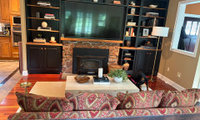
Maybe a Samsung The Frame TV so you don't have a black hole in the black built-in, when not watching TV.
My 75" Frame TV with 3" DecoTV Frame.
It also has matte glass so you won't get as much glare from the windows/doors.
Maybe consider turning the two leather chairs to face each other, with an ottoman between? There seems to be no reason for them to face into the room, but facing each other suggests "this would be a great place for a one-on-one conversation" and also lets occupants enjoy what looks like a lovely green view. Something like this, but with that rug (chairs, dog, and all) returned to its existing position aligned with the walls. (AI simply would not follow my instructions about that!)
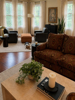
BTW, I think the wall color in this photo is beautiful and I'd keep the white trim.

I actually think the sofa can work really well here. I wouldn’t try to make it look more modern — its character is what makes the room interesting. Instead, I’d let the more modern elements around it create the contrast. The travertine table is already doing that beautifully.
I also like your instinct to bring in olive or moss green. With the saddle leather, copper, warm wood and ikat, a muted green would add another layer without fighting the existing palette. I’d introduce it in two or three smaller places rather than through one large statement piece — perhaps pillows, something in the artwork, and a small accessory.
For the bar cabinet, I’d go in the opposite direction from something new and polished. A substantial vintage wood piece with beautiful proportions would make the mix feel intentional rather than like you’re trying to make everything belong to one period.
The entry is also where I’d have some fun. Since you can see it from several parts of the room, a beautiful statement light could make that little area feel much more deliberate.
Your vintage/modern question actually reminded me of a video I recently made about five luxury pieces that have survived changing interior trends. Some of them — particularly classic lighting and mirrors — work so well precisely because they can sit alongside both older and contemporary furniture. It might give you a few ideas as you build the next layer of this room:
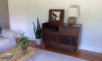
Art and its placement is subjective.
It doesn't have to be equal or smaller than the console ... again very subjective!
Some people are comfortable with art from floor to ceiling on every wall and some people are not.
You can look through Houzz Photos for ideas. When something looks interesting save them to your Ideabooks.


Collections are also art.


There are no rules to hanging art.
This is along the lines of what the above commenter’s suggestion would look like- as far as the placement of three pieces over the console, hung high enough to clear the open turntable cover (and clear the lamp).
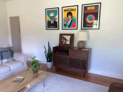
You could perhaps hang them a bit lower. The size of the pieces could be smaller to not extend past the console as much; but the art does not have to line up with the size of the console. Another option would be two pieces.
Also, art is not an accessory. It does not have to match the space, color-wise - nor does it have to have a theme, etc. It ‘can’ match and/or complement the space colors, and it can have a theme, but that is personal preference.
So find some art that you love - and take it from there.
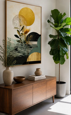
If it were me, I’d aim to create a better balanced wall in general, as even with art the piece of furniture will still feel lost. Do that first and then test some art and if sizing and placement are difficult to decide on, use Kraft paper templates. Given your decor, I think less will be more (ignore the dimensions below, but hope it helps).
YIKES! I didn’t think it was possible for a knife block to give me the creeps!
Every time I look at photos now, my first thought is ... is it AI slop or is it real?
I hate that we have to doubt what we see with our eyes!