


Neue Aktivität


Another option for the columns would be to leave them and box them in white boards - we did this on a ranch house years ago, took a handy man 2 days and cleaned up the facade a bit (easy to reverse if desired down the road)
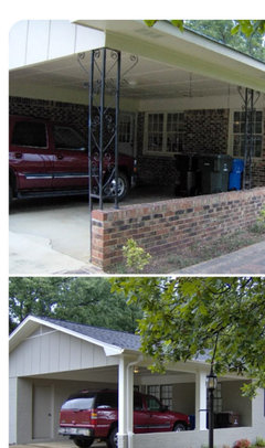

You can do much better than that. You need something that brings out the warmth and beauty of the wood. Your two choices fall flat. No grey.
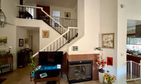

There is not much to gain by trying to throw a tv over this fireplace. Unless you are open to covering part of the L - which you say that you do not want to do. So there are not many options for a wall mounted tv there that would not look awkward.
Plus, what do you gain by a tv over the fireplace? It will make the viewing height too high - and for what?
Sometimes, putting a tv over a fireplace is a logical choice for a space, and it can work. But it is mostly not an optimal placement. And it is also not the best Feng Shui - in terms of giving the tv such a prominent position in the home; it can make the tv appear to be more important than people.
I think you need some type of proper tv console... not only for a better look for the tv setup - but also to have a better look for your entry.
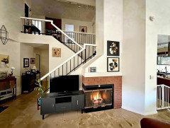
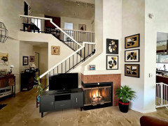

Your idea is the best one so far, I've done it many times. With your layout it is probably the best option! Good thinking
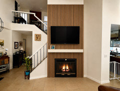
Well, i moved tv near front door. its an improvement for now new tv would prob be hung and wont need sound box (hard of hearing). i agree with pearl remodel and still feel tv hung on slat wall over FP tues room together. thanks!
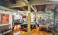
Lovely space. Live with the light green for a bit. Why highlight the beams with black when there are so many other interesting elements in the room as well?
What a great space!!
I don't like that particular shade of green (personal preference), but more than that IMO it fights with the wood ceiling. Don't like the black mock-up either -- too harsh. Maybe a rich chocolate brown. Or, pull something from your artwork. See the deeper red-brown or the rusty darker red in the picture of the naked lady? There you go. What colors do you have in your art that you can pull out and repeat on the beams?
I kind of like the green I would live with it for awhile if you like it too.

If you have floor space in the room, could you build out the soffit to the floor and then move the vanity and mirror forward to your new full height wall?
I like the minimal frame approach, I’d also mount a height adjustable mirror to the side for more flexibility
*showing this one for concept, not sure this is high quality

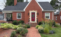

Gutters match fascia. Downspouts blend with the wall.
My fascia/soffit are dark brown and my gutters are brown/bronze.
My stucco is off-white and my downspouts are the closest off-white color the gutter company had.
You don't have brown anywhere and the very white gable trim makes brown/bronze gutters look weird on the rest of your roof.
Gray/black roof with brown/bronze gutter looks like you tried to match, but missed badly.
Keep it simple!

You have white trim, so the gutters should remain white. In your bronze pic, the white trim around the gable is so much more prominent than the barely visible white trim on the horizontal roof. Just paint the downspout to match the brick. It doesn't matter if you get an exact match, somethin pretty close will hide it. If you don't want to paint, change the downspout to bronze and leave the gutters white.

Hard to believe this was done by an architect.
Consider continuaty. Details like the way the roof is done should match, and why black and white windows?
Reduce the pitch of the porch roof to raise the fascia.
Remove the roof that extends past the porch on the right.
Remove the transom window.
The rendering should be done from ground level -- what a normal person would see standing on the ground looking at the house.
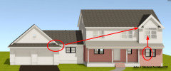
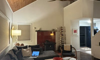
Something like this?
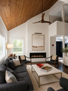
Be careful how the fireplace surround meets the balcony railing and overhead. I can't see the vertical relationships well enough to know what aligns with what. At the balcony, the new wall should overlap the railing so the right side of the new wall is flush with the interior of the existing balcony railing. The railing cap should meet the new wall's face. Then the addition will look like it was always there. (Not sure that's clear, but your contractor should be aware of these issues.)
As for sizing the surround, I would want the window left of the fireplace to have at least the same wall space on its right as it does on its left. (Chatgpt didn't quite do that.) Measure from the wall to the left side of window, then measure that same distance to the right of the window and mark that point. That's the farthest left the finished fireplace surround should extend. Measure from your mark to the entry wall; that's the maximum fireplace surround width. You can then choose the appropriate fireplace width to look right within the surround's width.
And yes, all the way to the ceiling! (You'll notice I took off the chaise part of the sectional for this image, so the furniture would look appropriate for the new arrangement.)
Looking more closely, I see that the dropped ceiling over the balcony ends at the post, which is a couple of feet short of the balcony corner. That means that a straight-up fireplace surround, even extended over the balcony railing, will not meet the dropped ceiling as chatgpt showed above; it will leave a slot of original wall going up to the wood ceiling. Something like this:
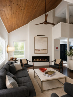
I think that's okay, but just FYI . . .
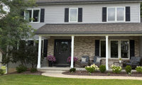
Agree that the bright white is a little too emphatic, but I'm not wild about the black either. Maybe just soften the white a bit to a pale greige that marries siding and brick?
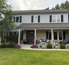
(I also grew the landscaping in a bit, which time will do.)
Stay with the white. The black craze is a splash in the pan. LET IT GO
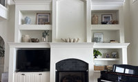

Art is what you love, not where you live. Think about the colors you like-right now the living area has no color.
I also wonder if you only had something like a linear basket on the two lower shelves on the right if it wouldn’t balance the heaviness of the tv on the other side. Just a thought.
Florida ... season is coming and most towns/cities have art/craft shows every month that are worth visiting. You can buy original art right from the artist.
A hallway is just that. It is so small and narrow I wouldn't worry about visual interest. What you have now looks like a ladies vanity/dressing table. Is there any way to remove the shelf and do a closet? With shelves? If you do a runner - so it doesn't look choppy - I would do a long one from the front door past the stairs. Small shorter ones will slip around
Your floors are lovely
Have you considered removing the interior door?
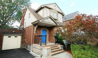

Simplynatural…more neutral like this?
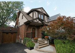
My decorator chose Oxford brown for my Tudor home's trim, front door and garage door. It looks good with my brick and warm toned stone. I think it would look less stark than black for your home.
My stucco is a cream color. Less stark than white. Be sure to test any cream or beige before you paint. Use large test sheets and check it at different times of day. Cream can look too yellow, and beige can turn to peach or pink in some lights.
I suggest you cut back the tree limb that covers the front window. It would be nice to see your attractive window while walking up to the house.
Painting the downspout dark would make it less obtrusive, with a dark downspout extender.
Charming house.
The landscaping looks as if it may block the view of the house from the street?..also a home this size with that much detail ..it seems that color variation should be a little subtle?
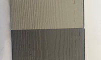
This is Brownwood? Owens Corning?
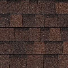
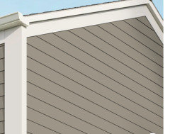
Monterey Taupe...nope!
Not seeing Aged Pewter with the Brownwood either.
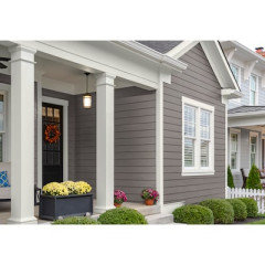
If the roof I posted is the correct Brownwood, I would go with James Hardie Country Red. Don't do that phoney wood grain look. Go with a smooth finish.
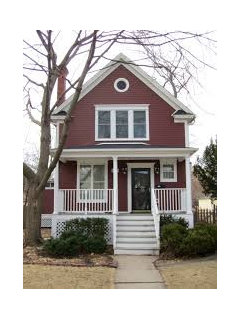
James Hardie has white trim...have the installer beef up the window trim. Go with a dark brown door and paint the storm the same brown. All should look great with the white fencing.
An aside, and you probably won't go with this suggestion, but that bay window just doesn't belong on your great house. Replace it with a similar to the double window in this photo.

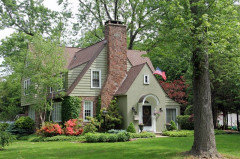
Sage green can work really nicely with navy. You can’t see it in the first photo, but it mentioned a red/brown roof.
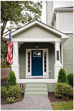
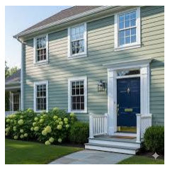
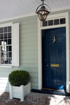
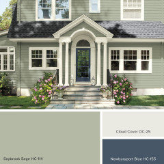
One more…can’t tell the door color but navy would work.
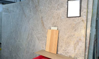
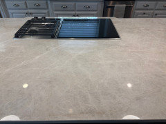
You can get away with putting hot pots and pans on granite, but it is not advised.
I have granite where I live now. 98% percent of the time, I use trivets. It is just habitual for me. I have never thought to place hot pots and pans directly on any countertop material. Very occasionally, I might be rushing or am feeling super lazy and I rest the pot on the granite for a few seconds - I am not overly concerned, since it’s granite. But I mostly use trivets.
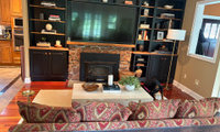
Maybe consider turning the two leather chairs to face each other, with an ottoman between? There seems to be no reason for them to face into the room, but facing each other suggests "this would be a great place for a one-on-one conversation" and also lets occupants enjoy what looks like a lovely green view. Something like this, but with that rug (chairs, dog, and all) returned to its existing position aligned with the walls. (AI simply would not follow my instructions about that!)
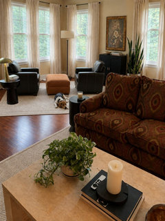
BTW, I think the wall color in this photo is beautiful and I'd keep the white trim.
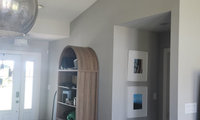

Do it! get rid of the arched shelf unit.
. I have a hard time seeing chinoiserie wallpaper playing nicely with the rustic vibe of your flooring.
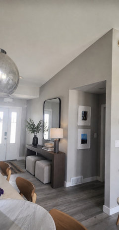
Yes, add a console with mirror. Add stools underneath if you need a place to sit to slip on shoes.

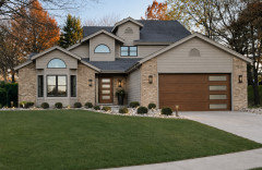
Ai changed the siding and brick color slightly, but I think it's a good style and look for your home.
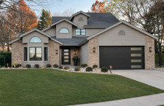
My thought on seeing dirt is that I like to see things that let me know when they are dirty. Everything gets dirty I think nice to know before guests walk out with filthy socks.
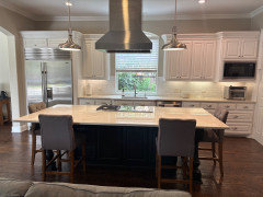
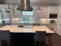
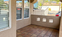
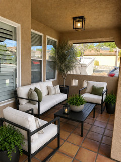
The perspective is all off so the layout will need to be different, but a simple black metal frame patio set would be very nice in the space. A new larger light and greenery would help to freshen the space too.
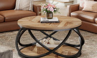
What was wrong with this one (from your post five months ago)?

Visually, I like this arrangement better as well, although I realize it's harder to put your feet up.
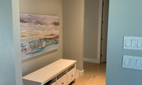

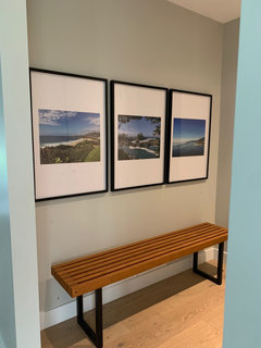
Took a mini break from Houzz and actually finished some projects. This is the end result of the front nook area and it is perfect for us. I still want to explore a floating bench but we had significant trouble finding a woodworker to make the bench so settled for this upgrade instead. The photos make me smile
Every day and I love them.


To me a dark charcoal gray makes it less woodsy and a bit more stately.
Add your green with the front door in a nice sage.
I think the shutters are nice...they ground and balance the gable detail. I like the white trim and it does not look cluttered.
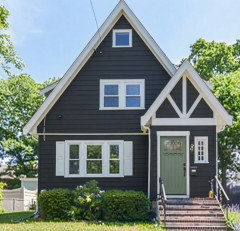

I've been following along but haven't commented until now. IMO, you have a lovely home and I don't think you should be concerned with the white windows. They bring personality and are consistent with the style of your home. I get a lovely cottage-y feel when I look at your house and the windows suit that. Black windows would be out of place. I think your trim is lovely and wide and the shutters are unneeded. Added landscaping with some color will add contrast and even more life to the overall picture.
If you feel a storm door is necessary because of your climate, consider a full lite door that will show off your front door as much as possible. I would be even better if it was painted the same color as the front door.
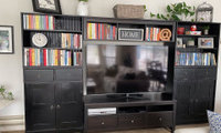
Prime first with a high adhesive primer like KILZ® no sanding necessary.
rather than white, how about the same color you have on the walls?
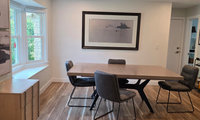
I struggle a bit to marry the calm serenity of the art with the lively colors you like, but maybe something like this could work (using @Emily's rug)?
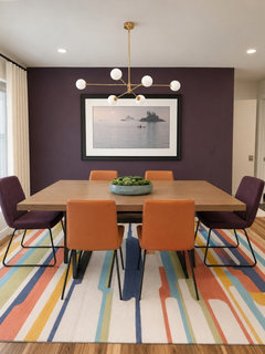
(Sorry, I know you nixed the dark wall, but it's what the art needs!)
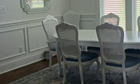

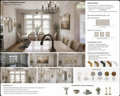
I think this room already has a beautiful classic foundation, so I’d keep the updates simple and balanced rather than filling every empty wall.
For the 11-ft wall, I’d choose one larger statement piece around 60–72 inches wide. It will feel more intentional and less busy than several small pieces. If you prefer a gallery look, three coordinated vertical pieces around 20 × 28 inches each would also work well.
For the areas beside the windows, I’d keep things lighter — a pair of narrow botanical prints or tall greenery would add balance without competing with the windows.
I wouldn’t add too much around the mirror either. A pair of small sconces or narrow framed pieces is enough; leaving some negative space will make the room feel more elegant.
Since you already have white glazed cabinetry and Calacatta marble, I’d use antique brass/warm gold, medium natural wood, or a very thin black frame. Artwork with warm neutrals, muted blue-gray, soft olive, taupe, and touches of brown would tie everything together beautifully.
I created a quick visualization to show how these ideas could work in your space. Hope this helps! 😊
I would like to thank all you for taking the time to help me with my dilemma. Each suggestion and recommendation will help me to move forward . Ying1 your visualization was so helpful. I am visual person, so to be able to actually see it all together was great! Thank you for taking the time to do that.
Thank you all again...each of you are remarkable!!
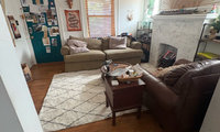
@housegal200 …… lol, exactly what I was thinking, ”don’t even THINK about a bean bag anything” …. omg!
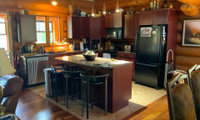
I dont particularly light the corrugated metal, but, thats a personal choice. If you do, then go for it. It doesnt look like there is room, to make your new island longer than the one you have now. I might rethink, that change. I would keep the island the same color as the cabinets. Something in your kitchen is bothering me a lot. Lack of any type of color, and all dull brown tones everywhere. Kitchen, should be lighter, brighter, and a happy place to spend time in, and yours that you now have and your new renditions, dont give me that vibe.
I am also not loving the taupe or barn wood with the other natural wood. Looks like a warm-cool clash. I like the idea of cream, or sage green also looks good in rustic kitchens.
I just read throught all of the comments and noticed someone suggested sage green. That is exactly what I was going to suggest as well. Do you think that might work?

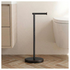
We use a toilet paper holder/stand. It’s very convenient and handy.
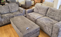

The set is far worse in the AI. Post a picture in your real space: ) Please?
I have something different in my laundry room. Never thought about it until now, lol.
Your laundry room does not look like your kitchen; and I do not think anyone would mistake the two. Also, I think that installing Carrara marble in the adjacent laundry room, too, may take away some of the panache of the kitchen. There is such a thing as overdoing a thing - to the point of the novelty wearing off.
You have what my family calls a ”utility room”. A gem! The counters will receive a lot of use, maybe washing off muddy shoes, and you say tinker space, with perhaps glues, Goof-Off, solvents, etc. Consider countertops that will stand up to it. Like Corian or even Formica.