Before & After: An Airy London Kitchen Packed With Family Storage
Creating an uncrowded feel while ensuring there were plenty of cabinets was the challenge in this compact eat-in kitchen

This Victorian terrace house in London, UK, had the classic layout of two front reception rooms and a kitchen squeezed into the back, which wasn’t ideal for a family of four. The decor had seen better days, too, with the kitchen cabinetry on its last legs.
Extending into the side return and opening up the dining room to the kitchen created a much more useable space. But the owners weren’t sure how to kit it out to ensure it felt airy and Scandi-minimal, while being super-functional at the same time. Read on to see how interior designer Ruth Milne’s skills and spatial planning helped the owners create their perfect family friendly kitchen/dining space.
Extending into the side return and opening up the dining room to the kitchen created a much more useable space. But the owners weren’t sure how to kit it out to ensure it felt airy and Scandi-minimal, while being super-functional at the same time. Read on to see how interior designer Ruth Milne’s skills and spatial planning helped the owners create their perfect family friendly kitchen/dining space.
As well as being small, the old, white kitchen was pretty tatty. “It probably wouldn’t have lasted another year,” says Milne.
Is your kitchen crying out for a transformation? Bring it from ‘before’ to ‘after’ with the help of a kitchen designer near you
Is your kitchen crying out for a transformation? Bring it from ‘before’ to ‘after’ with the help of a kitchen designer near you
The new kitchen is in birch plywood, which kept the pale palette but brought in warmth and natural texture. “We did our garden office (which is on my Houzz profile) in birch ply and we love it; it’s a very relaxing space to be in,” says Milne. “That’s inspired me to bring ply into other people’s homes.
“I’m doing more and more kitchens [using wood],” she continues. “I think we’re moving towards natural materials and showing them for what they are, rather than covering them up.”
Beneath the sink is an undersink cupboard, a pull-out bin, then a dishwasher to the left, flanked by a fridge-freezer. “The washing machine was always in the first-floor bathroom,” says Milne. “That was a huge help in terms of space-saving – we wouldn’t have been able to achieve this layout if we’d had to include a washer-dryer.”
The owners had a limited budget, so the kitchen carcasses are Ikea, which they paired with standard cupboard and drawer fronts from Plykea. The benchtops and splashback are crisp white quartz by Silestone.
Milne kept the area above the sink free of wall units. “Even though we were tight for space, it felt quite important to have the shelf above the sink area, so it felt open,” she says.
The shelves are also made from birch ply. A routed-out channel under each one contains an LED strip for a soft glow at night.
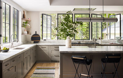
Browse more beautiful kitchens with timber finishes to inspire your own
Browse more beautiful kitchens with timber finishes to inspire your own
A second shelf runs right along the bank of units opposite the sink. “I love the open shelves,” says Milne. “An open shelf means you can give it your own personality.”
The spherical wall and pendant lights are elegant and unobtrusive, giving the plants centrestage. “They’re lovely, simple lights,” she says.
The spherical wall and pendant lights are elegant and unobtrusive, giving the plants centrestage. “They’re lovely, simple lights,” she says.
Key to the balance of having an airy, uncrowded space but with lots of storage is this run of cabinets. “It wouldn’t have worked unless we’d banked out that wall with storage,” says Milne. “The family even use the space under the bench for kitchen things; they like to be quite neat.”
When the plans were first drawn up, there was a bigger nib wall here (between the old and new sections). Milne worked with the architect to make that as small as possible, so she could fit in a long run of cupboards. These are wall rather than base cabinets, so they’re slimmer.
“We had to push the nib back as far as we could, so we could sail across it with shallow storage,” she says. “It wouldn’t have worked with 600-millimetre base units – there wouldn’t have been enough space around the island.”
The benchtop on the long run is Formica on ply rather than quartz. “It’s a softer option than the Silestone to give this area less of a kitchen feel,” says Milne.
The old dining room was ready for a refresh.
The dining area now benefits from the open-plan layout, with plenty of light and a good view of the garden. In this photo, it’s clear how much of a difference building into the side return has made. The extra area is not massive, but it’s transformed the flow and functionality of the space for the family.
The flooring is engineered oak herringbone parquet with underfloor heating.
The flooring is engineered oak herringbone parquet with underfloor heating.
It’s possible to see from the front of the house right to the back of the garden now, but the team also fitted folding doors between the living and dining rooms. “They’re to make the living room a bit cosier when the family just want to sit and watch TV and feel snug,” says Milne.
The couple like to entertain and having their record collection on hand was important, so Milne left space at the dining-room end of the long cabinet run for their Vitsoe shelving.
The couple like to entertain and having their record collection on hand was important, so Milne left space at the dining-room end of the long cabinet run for their Vitsoe shelving.
The kitchen island isn’t huge, but it still offers both storage and a seating area. “Because of the width of the room, we could only have cabinets on one side,” says Milne, “but there’s still good storage, including cutlery and spice drawers.” The birch bar stools tie in nicely with the cabinetry.
So Milne could avoid fitting an overhead extractor fan, which would have blocked sightlines, she chose an induction hob with an integrated downdraft extractor, which has been vented through the floor.
So Milne could avoid fitting an overhead extractor fan, which would have blocked sightlines, she chose an induction hob with an integrated downdraft extractor, which has been vented through the floor.
Before, the house had the classic terrace layout with a side return, which made for a fairly narrow kitchen.
The new layout is a much more functional space.
A patio was laid when the house was extended, with the flush join making it a great indoor-outdoor space. The bi-fold doors slide and pivot, fold back fully and have slim frames. “They’re good for smaller openings, as they slide completely out of the way,” says Milne.
Unsurprisingly, the family love their new space, remarking that Milne came up with “designs and ideas for a beautiful home that we could never have created ourselves”.
Your turn
What do you like about this open-plan kitchen/dining space? Share your thoughts in the Comments. And if you found this story interesting, like it, save the images and join the renovation conversation.
More
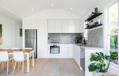
Take a look at this Australian Before & After: From Goer to Whoa, a Kitchen Reborn
Unsurprisingly, the family love their new space, remarking that Milne came up with “designs and ideas for a beautiful home that we could never have created ourselves”.
Your turn
What do you like about this open-plan kitchen/dining space? Share your thoughts in the Comments. And if you found this story interesting, like it, save the images and join the renovation conversation.
More
Take a look at this Australian Before & After: From Goer to Whoa, a Kitchen Reborn

Gesponsert
Laden Sie die Seite neu, um diese Anzeige nicht mehr zu sehen
Kitchen at a Glance
Who lives here: A couple with two young children
Location: London, UK
Property: A small Victorian terrace
Kitchen/dining room dimensions: Around 26 square metres
Interior designer: Ruth Milne of Studio Milne
Architect: Matthew Brumby of Pennington Phillips