Houzz Logo Print
amber6189

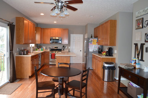
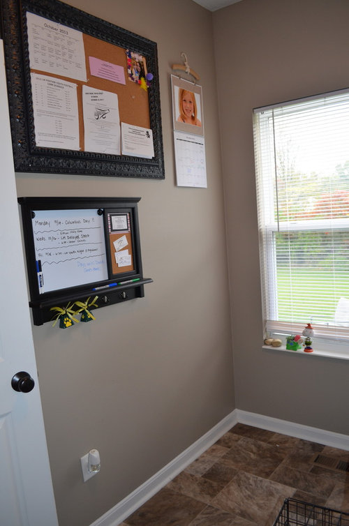
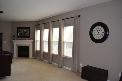
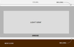
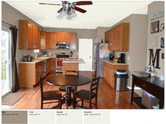
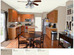
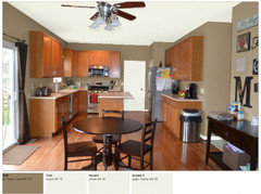
Picked the wrong paint color, need help :(

amber6189
vor 10 Jahren
We recently bought a new home and had the entire house professionally painted. The color we chose was Sherwin Williams Mega Greige (against the advice of our painter who suggested we go lighter). Well the color is SO dark :( I like the way it looks sometimes, but it mostly feels dark and heavy and has an olive green undertone, especially at night. Since this was my fault and not the painter's fault, there is no way my husband will agree to re-paint the house.

I am looking for suggestions to make this color work. Are there other things I can change (furniture, lighting, upholstery, etc) to make the walls look better? I originally wanted a gray color that was clean, bright and fresh. Here are some home improvement projects we will be working on in the next year: the kitchen cabinets will be re-surfaced (painted an antique white color with bronze hardware added), granite counter tops installed and a glass tile backsplash. The family room carpet will be removed with hardwood floors installed. All of the hardwood (including kitchen) will be sanded and re-stained a dark chocolate brown color. The brown leather couches in the family room will be moved to the basement once it is finished. Any suggestions on how I can make this paint color work? I am also looking for suggestions to add pops of color to my rooms without changing the wall color. What accent colors would work? I am a color-phobe so everything ends up beige around here :)

All suggestions are welcomed...thank you!

Kommentare (89)

  • joots07
    vor 10 Jahren
    re my previous comment -- your color could be French blue, ochre, magenta, whatever you like.
  • PRO
    Carolyn Albert-Kincl, ASID
    vor 10 Jahren
    I agree with bellesum that Mega Greige is too dark. It looks lovely in the photos, but I certainly would be unhappy with a whole house painted that dark a color and would take the measures I mentioned earlier to correct it. I was interested in what bellesum had to say about the light reflectance values because that's something I've never used but would love to know where they were found.
  • Ähnliche Diskussionen

    need help to decorate my doughters 5 and 8 years

    Q

    Kommentare (1)
    Hi yoursra dodo, a lot of children love yellow. Yellow with a red pigment makes a room friendly and cosy. And when it is dark, rainy and grey outside, yellow cheers you up. if you select the colour, hold the sample next to the door, the floor and the blue "sky" above the bed. Look at it in dayligth (sunny and cloudy) and in the night with electric lighting.
    ...mehr

    Choosing an Interior Designer

    Q

    Kommentare (0)
    Choosing an Interior Designer If you are thinking of working with an interior designer, be aware that the relationship is, by its very nature, intimate. Given this, you reap immeasurable benefits when you take some time upfront to consider just what it is you want from this person you're about to invite into your life. As with any relationship, clear communication can go a long way to alleviating any misunderstandings. Here are a few questions to ask yourself, questions to ask prospective designers, and some hard-won tips we've picked up along the way. Assess Your Work Style Before you pick up the phone and start calling prospects, spend a few moments thinking carefully about your preferred method of working. This little bit of soul searching will go a long way to ensuring you hire the right person, and will help to lay a solid foundation for a successful working relationship. For starters, think carefully about your answer to these questions: At what level do you want to be involved in the creative process? Do you want to be consulted on the nitty-gritty, day-to-day details, or are you more interested in big picture issues? Similarly, at what level do you want to be involved in the product research? Are you looking for comprehensive, "soup to nuts" guidance, or do you consider yourself design-savvy and only in need of assistance with color, space planning and resources? Are you a visual person or a tactile person? Will you be satisfied with a designer showing you photos of products, or do you prefer to see and feel everything before deciding whether it is right for you? Do you prefer to be shown many options or fewer? Are you open to the input of others? Are you able to make choices with confidence, or do you tend to vacillate? What are your expectations in terms of a timeline Determine the Scope of Your Project The scope of a project to some extent dictates the qualifications and experience required of the interior designer you are hiring. If you are building a new home or addition, or undertaking a major renovation to existing space, you are likely already working with an architect. This is good. Architects and designers often work in concert, balancing the aesthetics of the home's structure, or "bones," with the interior furnishings and finishes. You may want to get your architect involved in the selection of the interior designer—whether it's recommending someone he or she has already worked with, or using one of the interior designers the firm may have on staff. If you're redecorating a single room or have a limited budget for a space that does not require structural change, you may not need an interior designer at all. You may be happy hiring a specialist, such as a color consultant, who can work with your existing furnishings and help you revamp the space with new paint color and fabric selections.
    ...mehr

    What colour/fabric for soft furnishings

    Q

    Kommentare (19)
    Hi Ella, first of all, let me say that you have some really nice vintage pieces in your home! If you are planning to keep the light grey rug I would go with a darker shade of grey for the daybed and a lighter shade or a completely different color for the fabric of the sidechair (e.g. like the dark blue in your third photo) in order to create more contrast and give the room a more dynamic feel. You also mentioned a portrait to be hung above the sideboard - maybe the colors of this picture can aslo inspire the fabrics, it's always nice if the same color pops up in different details of a room. I hope this helps in your decision making process and I would love to see the results. Many greetings Anita Goda from Studio Wunderkammer
    ...mehr

    Zwillinge Schlaf Zimmer mit Dach Schalger

    Q

    Kommentare (6)
    The pillowcase gives you a good impression. For me light colours do not work as good as darker ones. The petrol (right corner) would be great. But what colour does the girls love? If it is pink you go for a darker one or purple. And it is always best to test the look first. So buy just a small sample of the colour and try. If a dark colour is too dark for you, just paint one wall and the others white.
    ...mehr
  • bellesum
    vor 10 Jahren
    Carolyn, SW and BM do provide the LRV for paint colors online. ICI Dulux or Glidden goes by a paint code system that works the same internationally. It includes the LRV, chroma (intensity) and the color family. I believe professional architects specify color that way. With the technical information, I think it helps to make a more educated guess within a fan deck. I noticed that colors above LRV 80 would show up almost white. The muted colors that show up on photos but do not dominate a room tend to be around LRV 60-70. BM revere pewter at LRV 52 would look good in very well lit rooms but I suspect it would look darker in less bright north facing rooms. Also, with the color family information, you have a better guess as to whether a grey paint would throw green or blue or red in different lighting. These are just my non-professional observations.

    I would not use a interior paint color below a LRV of 50 (or even 60) for a general color. For one thing, it has an impact on energy consumption as walls absorb more than 50% of the light. It may be quite gloomy in the winter.
    amber6189 hat bellesum gedankt
  • PRO
    Carolyn Albert-Kincl, ASID
    vor 10 Jahren
    Fascinating, bellesum. I very much appreciate that information. Many thanks.
  • regina5697
    vor 10 Jahren
    When you are through with the rest of your renovations, re-evaluate the paint. I love it, but right now the orange tones of the cabinets and wood floor create the green undertone. Once you make your changes, and I think you are on the right track for those color choices, you will be much happier with your paint color. It can't hurt to experiment with light bulbs in the interim.
    In short, don't think you've made a mistake with your paint.
  • Jean M
    vor 10 Jahren
    I like your wall colors too ! Having your cabinets painted white will make a huge difference in the kitchen. I agree with a previous poster about removing the fan above the table and adding a chandelier. Maybe a rug? Also, your curtains in the living room look the same color as the walls. You could add some color there or go with a white.
    I wouldn't add any more furniture that is dark, the couch and entertainment center are enough. Very pretty house !
  • Samantha Rottschafer
    vor 10 Jahren
    Love the color as well! I also think if you some pops of color with accessories it will brighten it up, as all your furniture and cabinetry is very dark. There are some great ideas in the Houzz idea books on how to best compliment the color grieved. We are building new soon and will be going with something similar to this. Maybe try accenting with some celery green accessories and even a not-so-mustard yellow?
  • nasmijati
    vor 10 Jahren
    @bellesum. Thank you for the information on light reflective values.
  • samsamyd
    vor 10 Jahren
    To relieve your color phobia, go to a fabric, upholstry, quilt store and find a fabric that you like which contains one of the colors you can't change in your decor -- then use the other colors in the fabric as the best candidates ...lighten or darken them to give you some variation ...but pull them out for the remaining upholstry, rugs, accents ... that let's you capitalize on the color selection experience of the (fabric) designer, and sinc you like the fabric, you'll likely like the other colors. [Twas a hint to me from an interior designer, and it' works for me]
  • melwishes
    vor 10 Jahren
    Hi Amber, what do you think of the suggestions so far?
  • Laurie Tillett
    vor 10 Jahren
    I would repaint (when you are able) start with one room, then move on to next. Try BM Edgecomb Gray....it's not a true gray, it's more of a pale mushroom color....so so versatile...looks great with dark woods, warm woods, even pale woods. It's the kind of color that you don't really notice....your eye goes to art, furniture, the fin and beautiful things in the room....not the walls. And, isn't that the point of it all in the first place?
  • mjbeamers
    vor 10 Jahren
    New curtains, something that pops. I really like the paint color. But you should add items with color. Nix the browns and blacks.
  • amber6189
    Ursprünglicher Verfasser
    vor 10 Jahren
    Thank you everyone for the wonderful suggestions! I was actually shocked when I saw all the comments on my post. I love the idea of adding teal blue and lemon to bring some color into this room. I am thinking more like a Tiffany blue...any thoughts?

    I am considering every single suggestion above. I am going to think about having some rooms in the house repainted. It sounds like the opinions on the paint color are split - some like it and some don't. I will say that the walls photograph very well when there is a lot of natural light in the house, but the walls are very dark and have a different tone in person. I am considering having the foyer and other spaces repainted, but it will take time. My foyer and some other rooms have cathedral ceilings, so I will have to hire a pro. I have seen a few suggestions above for a lighter/brighter gray, and I will definitely be looking into the light reflective quality next time. I wish I had known about this before....so very helpful!!

    I love the suggestions about new curtains in the family room and also the sliding door in the kitchen. I love the curtains posted above from Crate and Barrel. Are there any other suggestions for curtains? Could I use this pattern for both the family room and sliding door curtains, or should they be different or be more colorful? I am going to start looking for artwork to replace the mirror above the fireplace, and I am also going to take down the shelves and photographs over the couch. Any suggestions for this wall? Can I hang my shelves and photographs somewhere else that would work better....like a hallway? I have a lot of smaller family photos that I definitely want on display somewhere, but I'm not sure where it will work.

    I am also going to look for pillows and throws to add color. You can't tell from the picture, but my entertainment center has glass doors and shelves to display items. What kinds of items can I get for the entertainment center? How much color is too much? I am really horrible at this, so any suggestions or specific items you could post would be great. I am looking for things that are affordable. I have a LOT to buy so it will have to be in small doses.

    Thank you again for the suggestions. I look forward to sprucing up these rooms, but I am nervous because I feel like I have a vision but I'm not good at deciding what to buy and my decorating never seems to turn out the way I want it to.
  • amber6189
    Ursprünglicher Verfasser
    vor 10 Jahren
    Just reading through the comments again.....the "yellow" color around the fireplace is actually marble so I don't think this could be changed easily or inexpensively :( The brown couches do recline so it would be hard to put a table behind them, but I might try moving the console table from the kitchen and put it behind the sofa to see how it looks. I cannot wait to move these couches to the basement! It won't happen soon enough for me. I am going to look for something lighter (closer to white or off-white) and I love the suggestion for getting a chair in a pattern.

    I will be getting a rug for the breakfast table (and a new table in fact) and I will be removing the ceiling fan in the kitchen once we are ready to remodel. I also want to change or remove the collage over the console table in the kitchen. It was a Pinterest thing that just didn't work out. Any suggestions for this wall?
  • PRO
    Carolyn Albert-Kincl, ASID
    vor 10 Jahren
    I really like your draperies and would definitely not spend money on new ones unless the ones you have are in bad condition. They look custom and expensive and just right for the room.

    Regarding family photos, they look good hung in a hallway or stairway area, or even in a powder room where a captive audience can enjoy them. Hang them with about 2" space between each one.
    Urban Homestead · Mehr Info
  • PRO
    Studio Boise, LLC
    vor 10 Jahren
    One really quick and easy help would be to put small white lights aiming up on top of the cabinets (with the light bulb not visible of course).
  • PRO
    JudyG Designs
    vor 10 Jahren
    Paint color is fine! I do suggest you stop adding any more black/dark furniture.

    Just a suggestion….the back of your sofa is not attractive. Consider a console table to hide the workings.
    Chalet Interiors · Mehr Info
  • reggiesmall
    vor 10 Jahren
    Lovely home and beautiful color! It's very elegant.

    Dare I suggest that you don't do anything else or spend on anything else until you redo your cabinets and counters ( and floors, but those will for sure look great with the walls)? You might be throwing good money out if what you do now or buy now doesn't go with your new cabinet color/ finish and counters. You don't want to have to then match the cabinets or counters to the items you'll be buying now because you'll feel bad that you already have them.

    If it were me, I would wait, live with it, edit the room and move things around, bring in items in different colours from other rooms to test out first and do the cabinets and counters first. You don't buy towels first and then redo the bathroom.

    Don't forget to have a cabinet door sample made first, in the color and finish you want, and see how it looks in your kitchen, during the day and at night. As we all know, mostly through
    bad experiences , a minuscule sample is basically worthless.

    Good luck!
  • PRO
    Carolyn Albert-Kincl, ASID
    vor 10 Jahren
    Calling in a professional interior designer in your area would also be a good move. There's nothing like on the scene advice.
  • PRO
    LB Interiors
    vor 10 Jahren
    Zuletzt geändert: vor 10 Jahren
    I would probably get an antique white chandelier in the kitchen to go with your future antique white cabinets.

    I think I would 'color block' a few of your walls and add the lighter gray on them. You can do this a little at a time and maybe hubby won't mind a couple of gallons of paint if you can DIY.

    Tape off some of the larger walls with large rectangles to paint the lighter gray color inside the rectangles. This will give your eye the break from all the dark walls. You can leave the two paint colors meeting each other .... or ... You can border the large light gray color blocks with adding a simple 3" band of white between the two colors. I will try to study what walls that I think will work for you ... : )

    Something like this:
    Color Block Wall · Mehr Info


    Walls to add light 'color block' walls. Whatever size you want, but should be the same size in the same room.
    1. Fireplace wall corner
    2. Left wall (shelves) perpendicular to the TV unit
    3. Maybe the clock wall

    Adding an accent color other than neutrals will bring life and interest to the room. Drapes, pillows, rug and accessories.
  • PRO
    LB Interiors
    vor 10 Jahren
    Zuletzt geändert: vor 10 Jahren
    I love your rooms and you don't need to change furniture. Maybe you can add a contrast color band of fabric to the drapes on each side of the panels. No need to buy drapes again.
    Window Treatments · Mehr Info
  • PRO
    LB Interiors
    vor 10 Jahren
    Zuletzt geändert: vor 10 Jahren
    If you add with a mirror in a silver metallic frame or paint out one that you have, I think it will work with what you've started. If you need any furniture pieces I would go white or silver metallic finish or mirrored or glass tables if you still need these items.
  • PRO
    LB Interiors
    vor 10 Jahren
    Zuletzt geändert: vor 10 Jahren
    In the kitchen, I think colorful drapes, maybe a semi-sheer woven in a print, more light weight fabric, if budget allows. A colorful rug under the breakfast table that will dictate your drape color.

    Something like this but not pinch pleat heading
    Cotton Canvas Printed Window Panel, Koba · Mehr Info
  • PRO
    LB Interiors
    vor 10 Jahren
    Zuletzt geändert: vor 10 Jahren
    You could DIY spray paint antique white on the breakfast table top and pedestal. Would be a nice contrast as is now, and when you redo the cabinets and the dark floors with a rug under it.
    Dining · Mehr Info
  • PRO
    Carolyn Albert-Kincl, ASID
    vor 10 Jahren
    While I like the looks of a nice rug under a dining table, I prefer to leave the floor bare if it's a breakfast table. I admit that's because being a practical creature, and having clients to see, I just don't want to spend the time cleaning under the breakfast table. But there's also the element that I like the look of the floor! In fact, I like your breakfast table as it is and think you don't need to change it unless you want a bigger one.
  • PRO
    LB Interiors
    vor 10 Jahren
    When you get your new dark floors, I think you would like a contrast from the floor to the breakfast set. It will look all dark. If you choose to not want a rug, then I would either lighten the chairs in antique white or the entire set. The dark dining set will blend into the floors too much MO
  • PRO
    LB Interiors
    vor 10 Jahren
    If you get dark wood floors and use your current dinette set, then I think you might want a rug to break the visual weight and loss of contrast from the floor to the dining furniture.
  • Jennifer Abbott
    vor 10 Jahren
    I love your wall color. At night it probably would look very dramatic.
  • auntiebuzzybee
    vor 10 Jahren
    I like your dinette set. Very well proportioned for area allowing you to have other pieces of interest. I REALLY like your chairs...now carp diem and get some red or yellow seat cushions. Baby steps to embrace colour and gain confidence to try a whole new approach! You're going to do great. Its empty looking now but you have the bones and it's allllll you! We all change our minds. We all have had that "coulda shoulda" moment but it's an experience to learn about the trades but also about yourselves. I don't suscribe however to struggling to like something you don't like gut feeling from the get go. I can't see buying all knids of furniture, lighting, pillows, accessories to TRY th change that gut feeling. Its a lot cheaper to repaint in phases and adjust and assess as you go. All the beautiful things cost LOTS of money..they are pretty but you will be the ones LIVING every day there and paying the bills. Listen your your inner voice and follow...enjoy. you will find your way with this, your new beautiful new home just waiting for YOUR PERSONAL touchs. Try your bold colour accessories if you want to but have been "afraid to". You can always take things back to store if you don't like what you see. It's your home. Its lovely. We all seem to like the colour snd think you will as you work with it. At some point, you oughta know if it's "you" or not. I'll be following to see what changes happen as you "journey" along. I have confidence in you two!
  • User
    vor 10 Jahren
    Once the couches are gone, I'd bring color into the room via whatever seating you bring in. The color of the walls aren't bad. I think some posters aren't reading what you said about the kitchen cabinets that will be repainted. Then, the color there will be beautiful! You have a pretty home.
  • Sam Dewick
    vor 10 Jahren
    I think your paint color is already nice though I agree with having the fan over the breakfast table replaced with a chandelier.
  • PRO
    WhatColor.org
    vor 10 Jahren
    Amber, so I worked up some pictures for you to look at. It is a way for you to be able to test out my services for free. If you like what you see, and would like to see more of my ideas or some of your own digitally painted on your walls, then you have to move to the paid options. It is $29.99 for the next 7 pictures, then $24.99 for any groups of 7 pictures after that. I would be happy to help you explore other options if you would like. There are many things that you could do that would look great with these rooms. It is a very nice place!

    If you find my service helpful, please let your friends know about it. I am starting to use this as a living, so word of mouth is HUGE!

    Thanks again for letting me help with these four pictures!
    randall \o/
    Whatcolor.org
  • joots07
    vor 10 Jahren
    bellesum, I suggest you contribute an article on choosing paint. The info on LRV is very interesting indeed, and Houzz people could really use any info connected with choosing paint colors. I don't agree personally that one must choose paint of a certain value, for me it's a matter of taste, but I do believe you have a lot to offer the Houzz community with this info and your own opinion on it.
  • PRO
    LB Interiors
    vor 10 Jahren
    Zuletzt geändert: vor 10 Jahren
    Choosing paint values are one of the most important decisions for a room from the color palette that is preferred. These need to be considered when choosing paint values. One's taste is based on the reasons stated. The value has a great deal of impact for these reasons:
    - the feeling that affects our senses - like - soft and subtle, bold and dramatic, calming and peaceful, energetic and lively, fun and funky, airy and light, cozy and warm (there may be more)
    - brightness regarding natural light and other lighting in the room
    - working with contrast in conjunction with other elements in the room including accessories and furnishings and artwork
  • bellesum
    vor 10 Jahren
    Here's an article by Lori Sawaya that I referred to.
    http://thelandofcolor.com/lrv-light-reflectance-value-of-paint-colors/
  • PRO
    Lori A. Sawaya
    vor 10 Jahren
    Thanks for the link, bellesum! Appreciate it and I can tell you've found your stride using color data points to create and customize benchmarks for choosing colors - great job, that's how it's done, that's what they're for.

    Looks like you've gotten some really good insight, Amber. Just want to say I'm so sorry the color didn't work out for you - hate it when that happens. But I have to say from my seat here in the peanut gallery, it looks rather fabulous. Might not be what you wanted and expected but I wonder if given some time and additional, homey elements that you'll grow to love it. I seriously see the potential for this to turn out really well!
  • PRO
    The 5 Design Team
    vor 10 Jahren
    I hate to sound like a broken record here, but the color is fine. I think you guys can add a few recessed lights in your kitchen for additional lighting and bright colored window coverings if you choose curtains or wood blinds either will work fine. Like some of the other comments, I think once you all get the floors and kitchen done it will look amazing!
  • PRO
    Carolyn Albert-Kincl, ASID
    vor 10 Jahren
    Zuletzt geändert: vor 10 Jahren
    The photos DO look great, but how would you like to have that color EVERYWHERE in the house...dark closets, dark hallways, etc.? That's the problem Amber is living with so I can very well understand her dilemma.
  • kimsiebold
    vor 10 Jahren
    I too like the color. You could add crown molding which will help brighten and complete the look and pull it all together.
  • Nina Pearlmutter
    vor 10 Jahren
    The color is good. If you don't like it everywhere, try painting one of the rooms a lighter shade; this often takes away the monotone look.

    You are using a lot of neutrals (gray, white, black, brown) and it sounds like you are planning even more. The curtains in one of the rooms practically matches the wall color. Try making some of the rooms pop with accent colors. To warm it up use fall-types oranges and reds; cool it out a bit with bright aquas. Use cheap throw pillows to find colors and patterns you like. You could also go with a stencil pattern on one of the walls to add interest.
  • shander5
    vor 10 Jahren
    Personally I love the color, as well as the rest of the color palate throughout your house. I feel everything will come together once you change the cabinetry, flooring, and like others stated - add crown molding. Changing the color should be your last resort once your done with the upgrades and still not happy with the color. But I have a feeling you wouldn't have to ;-) Keep us posted!!
  • teebabee
    vor 10 Jahren
    Color is very nice from what I see!
  • Fathy El Matbouly
    vor 10 Jahren
    I think if u make the walls the same color of the ceiling will a lot nicer and brighter :-)
  • marinagunn1
    vor 10 Jahren
    I love the color of the kitchen but would rid the brown drapes and get an airy white voile panel, etc., and if using the fan - change to a white to pickup the color of your door and countertops. Dining set seems a tad small for the room so might want to add the table insert if you've one
  • marinagunn1
    vor 10 Jahren
    ceiling molding would also make a big difference and highlight even more the color of your kitchen
  • PRO
    Provanti Designs, Inc
    vor 9 Jahren

    Love the color - very in and it will look great with your planned changes. Pops of color will add interest and depth. Adding color with art work, throw pillows and inexpensive area rugs is a safe way to experiment.

  • jonathan3
    vor 9 Jahren

    Old post.

  • Lazarus St. Bernadine
    vor 8 Jahren
    Zuletzt geändert: vor 8 Jahren

    Amber, your home is stunning. That being said, I always caution my clients not to go below an LRV of 45-50, if they are concerned the result will be too dark. Your painter really should have offered to put a sampling of your paint choices on the wall before he painted the entire room. So you shouldn't blame yourself completely.

    Many painters will also come back and re-paint a room for a fraction of the original price if they know the customer is not happy with the color. And assuming that your painter didn't even offer you the option of seeing a sample on the wall, that's the very least he could do.

    See if you can negotiate with him. You may wish to check out the colors SW Anew Gray or SW Agreeable Gray which are the lighter shades of Mega Greige on the same palette.

    You can purchase a small amount of each color to try on the wall yourself ahead of time, if you should decide to have the wall re-painted.

  • D. L.
    vor 7 Jahren

    The color looks best where it is accented with white - if you added more molding, it would read better. Fix the lighting - add more layers to the lighting AND change the bulbs. More reflective surfaces would help - I see your big mirror, but you have a lot of dark brown and not enough softness - you could use you could use more color and more delicate contrast in the room - curtains, an area rug, etc. Lighter colored furniture would help also - and maybe something softer than leather, unless you really love it. Soft-looking furniture would add visual comfort and would contrast to the hard dark frames.

  • Deb Anda
    vor 2 Jahren

    Just purchased a home where the entire house is mega griege , its so difficult to decide what to do

Deutschland
Mein Benutzererlebnis mit Cookies anpassen

Houzz nutzt Cookies und ähnliche Technologien, um Ihre Benutzererfahrung zu personalisieren, Ihnen relevante Inhalte bereitzustellen und die Produkte und Dienstleistungen zu verbessern. Indem Sie auf „Annehmen“ klicken, stimmen Sie dem zu. Erfahren Sie hierzu mehr in der Houzz Cookie-Richtlinie. Sie können nicht notwendige Cookies über „Alle ablehnen“ oder „Einstellungen verwalten“ ablehnen.