Orange Häuser mit unterschiedlichen Fassadenmaterialien Ideen und Design
Suche verfeinern:
Budget
Sortieren nach:Heute beliebt
81 – 100 von 1.905 Fotos
1 von 3
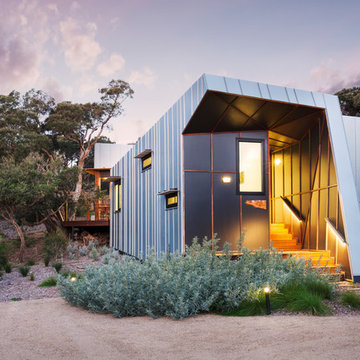
Kleines Industrial Einfamilienhaus mit Metallfassade, grauer Fassadenfarbe, Flachdach, Blechdach und grauem Dach in Melbourne
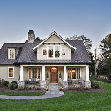
Mittelgroßes, Zweistöckiges Klassisches Haus mit Putzfassade, beiger Fassadenfarbe und Satteldach in Phoenix
Sited on 35- acres, this rustic cabin was laid out to accommodate the client’s wish for a simple home comprised of 3 connected building forms. The primary form, which includes the entertainment, kitchen, and dining room areas, is built from beetle kill pine harvested on site. The other two forms are sited to take full advantage of spectacular views while providing separation of living and garage spaces. LEED Silver certified.
Zweistöckiges Uriges Einfamilienhaus mit Backsteinfassade, Misch-Dachdeckung, Satteldach und grauer Fassadenfarbe in Sonstige
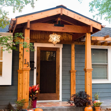
Rancher exterior remodel - craftsman portico and pergola addition. Custom cedar woodwork with moravian star pendant and copper roof. Cedar Portico. Cedar Pavilion. Doylestown, PA remodelers
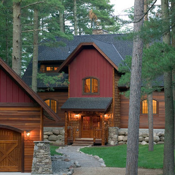
Großes, Dreistöckiges Uriges Haus mit Mix-Fassade, bunter Fassadenfarbe, Satteldach, Schindeldach und grauem Dach in Denver
In brief
Location, location, location
When looking for your perfect home where you can put down your grass roots and start a family there are many ‘must haves’ that we all have on our wish lists. The obvious contenders are price and location with many other niceties, like the number of bedrooms, layout and decor taking a back seat. As we all know, location can sell a home to those who strive to be in the right area, for transport links, local amenities and the all-important school catchment areas.
Like many other families throughout the UK our clients chose their house for its excellent location. Just ten minutes from the centre of Stafford by car, our client’s house is in a popular and sought-after suburb of the town for couples and families alike. They have always loved the location of their house for its easy access to work, schools, leisure facilities and social connections, but they were becoming increasingly frustrated with the layout of the ground floor of their home.
It’s inevitable that families will evolve and our needs from our properties will change too. Since the young family of four moved to their large four-bedroom detached house a few years ago, their property has been unable to meet their lifestyle needs and living patterns.
Although their property has adequate bedroom space for them and their two children, the layout of the downstairs living area was not functional and it obstructed their everyday life, making entertaining and family gatherings difficult.
Our First Meeting
Upon our initial consultation with our clients it was clear from the outset why they sought to make changes to the layout of their house. The property had been extended to create extra space by the previous owners, but unfortunately the design and build hadn’t been executed well at all. The rooms and layout were awkward in size and shape and it didn’t allow the family to come together and enjoy their home. They had the floor space, but it was sectioned off into separate rooms, some without a purpose.
The garden surrounds the house on all three sides and is of a good size in its entirety with different areas on each aspect. We could clearly see that the house itself didn’t address any particular aspect of the garden in any way.
Moving to a new house wasn’t an option, the family were happy with the location and size of the property. What they wanted was a modern, functional, stylish space for everyday family life, with the flexibility to accommodate their large extended family when needed and to ultimately add value to their property.
We were appointed by our clients to create a design solution to redesign the ground floor living area with a modern, light filled, open plan space that connects with the garden. It was clear from outset that our design intention was to break down the room barriers and to respond to the needs of the family, supporting their lifestyle now and for the future, bringing them together and creating a house they could call a home.
Delivering a project on time and within our client’s budget are always a top priority for our team. The family decided to stay in their house during construction, therefore it was even more essential to minimise the level of disruption to their daily lifestyle with a young family living on site.
The family needed help from our team at Croft Architecture to swiftly and successfully acquire Building Control Approval for their project to progress rapidly, ensuring project completion on time and to their determined budget.
Our Approach
Surveying the site
The client’s home is located on the entrance to a quiet cul-de-sac on a mature, leafy, suburban housing estate. Their home nestles into its well-established site, with ample space between the neighbouring properties and has considerable garden space to the rear and both sides.
During our initial visit we spent a long time with the family observing the existing layout, talking about how they currently live in the property, their annoyances with the house in its current form, how they would like to be able to live in their family home and how they aspired it to feel, look and live.
We walked through the house and it was clear that the existing layout didn’t work downstairs. The house had been extended onto before they had bought the property and the space hadn’t been well thought through in terms of how it would be used effectively.
The rooms directly to the left off the hallway, didn’t really have a proper function. The previously extended space had resulted in the house with too many rooms and subsequently this had led to a series of impractical spaces.
The long and narrow extension was home to a small U-shaped kitchen at the front of the house, which led onto the dining area and then onto a small room at the back of the extension. For the size of the house the kitchen and dining room in a much smaller and narrower area, leaving larger living areas to the rear of property with copious amounts of dead space. The small kitchen was tucked away at the front of the property which made life difficult for our clients to observe their children playing safely in the garden whilst preparing food and carrying out work in the kitchen. On the opposite side of the property there was another old extension which had a step down into it. This living area had a tiled floor and large glazed windows on all sides which made it feel almost like a conservatory.This area was rarely used by the family as it had no real function, plus it was hot in the summer and cold in the winter. It had become an under utilised space.
We walked around the property and it was clear that the house itself didn’t address their private garden space to any particular aspect in any way, meaning that the garden space was under used because of the poor connections.
The family wanted a combined kitchen, dining, lounge space for daily life and also for entertaining their family.
Design Approach
The size of the property presented the opportunity to substantially reconfigure the family home to create a series of dynamic living spaces oriented towards the large, south-facing garden.
Our team suggested removing the little kitchen from the front of the property and re positioning it within the unused glazed space at the back of the house.
The glazed room had internal French doors with a step down into the space separating it from the lounge. We proposed to remove the French doors, level the floor and make it into one room with the existing lounge.
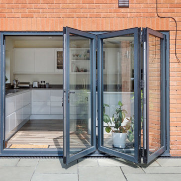
To connect the new open plan kitchen and living space to the rear and side garden sliding and folding doors were the solution, extending the family’s usable living space by creating a seamless indoor-outdoor flow. There was already a patio area there and it made sense for the kitchen to move to the rear of the house to be close to the patio for easy outside dining.
It was therefore logical to retain the existing living space in it's current location next to the new kitchen, maintaining the natural flow of the house for the family after eating and entertaining in the kitchen.
When making decisions regarding the kitchen design, we worked closely with the family. They thoroughly enjoy spending time cooking and entertaining with their large extended family. To assist with their culinary preparations our clients had aspired to have an induction hob within their new kitchen. As they were working through the design with us, they weren’t sure about an induction hob because of different cooking methods required for certain meals that they like to produce. They particularly like making chapatis which require a round pan and a gas hob. We didn’t see this as a problem and suggested having a single gas burner for purely this purpose whilst still installing an induction hob. They decided to go ahead with our idea, choosing a single gas burner and an induction hob, and it looks great!
The existing lounge space had a corner aspect at the rear property that protruded into the garden. Positioned next to the kitchen and dining space it seemed logical to us for the living area to also open out onto the patio, thus connecting the garden to the house on a wider aspect. To enhance the connection between the garden and the living room we thought that a corner door would work extremely well to really open up this space. The clients really liked the design concept to create a feature of the corner with glazed sliding doors that would completely open the house up to the garden. They were excited about the prospect of the allowing huge amounts of natural light into their home and the flexible access it would provide to the garden.
Once the new kitchen, dining and living space had been concluded, we then had to consider what the previous kitchen and dining area was going to be used for within the small, long side extension. We talked with our clients about a few possible uses. We noticed that the family have a piano and few other musical instruments. It made sense for this space to become a quiet part of the house for them to escape to, play music, read and generally relax in a snug area.
To shorten the length of the new music room and make an additional feature in the newly created open plan kitchen, dining and living area, we reclaimed some of the space from the back of the side extension and opened it up to the main open-plan space, thus creating another new snug. We added an additional design feature within the snug by creating a timber window seat. Not only does it provide extra seating, but it’s also created a snug within a snug, a haven for reading, napping and gazing out into the garden.
As part of their brief our clients also wanted a to incorporate a log burner into their newly remodelled home. To connect the new music room and snug to the living space we proposed to position a two-way log burner where the existing gas fire was located. By retaining a fire in the original location it would minimise the disruption and work required to install the wood burner. However, the theory didn’t turn into reality and the new fire resulted in being quite a task to get it to work. When the contractor began to strip back the existing fireplace, they discovered that fitting the pipe within the building was going to be more challenging than they anticipated because of the poorly constructed extension. It was difficult to execute but it was ultimately achieved.
What lies beneath?
It’s not until you uncover the fabric of the building that you fully understand what’s going on underneath. When the contractor exposed the structure of the house, we found out that the property had been poorly constructed, and they uncovered a lot of poor workmanship from the original builders. As the build progressed the inner skin of the extended structure was exposed, we found that it wasn’t actually strong enough and we needed to make it safe in order to proceed. Going forwards we ensured that the structure was safe, and all issues were identified and immediately rectified.
The previous extensions to the house also presented further challenges as the build progressed. We found that the floors between rooms were not level. We wanted to create the appearance of one space rather than lots of chopped up areas. To do so we needed to alter the floor and ceilings to ensure that they were flush right through the new open plan living space. Also, after removing the internal French doors, the down-stand beam where the doors had previously been were subsequently left prominent down from the ceiling. The design required careful planning and attention to detail to achieve the best looking finished results for the client.
For us, in principle our clients’ scheme at the outset was quite a simple project but when the strip out commenced there was actually a more going on underneath that needed attention before the project could start to take shape. A lot of things needed to be considered to make it work structurally and properly for the family.
When the carpet was initially lifted, we found a parquet floor underneath. The family and our team were extremely excited at the prospect of having a traditional parquet floor that could be sanded down and made good. However, when ‘all’ of the carpet was removed only half of the living room had been covered in parquet flooring and the other half was actually a solid concrete floor. Unfortunately, we couldn’t proceed with the flooring and our clients chose another floor finish.
Making connections
Our team at Croft Architecture have created a new, sleek, spacious family ‘hub’ that’s light with clean lines. The open plan space unites the family of four whilst providing the ability to gather the wider family and seamlessly connecting their home with the garden through the new full length sliding doors. Although they now have plenty of space to gather with the family, they also have areas of seclusion to spread out and escape to when needed.
A strong working relationship between our team, the client and Building Control enabled us to gain the necessary permissions promptly. We enjoyed working with the project team and we’re extremely pleased to successfully deliver the completed project. Although it wasn't in accordance with our client’s timescales with the discovery of hidden structural challenges, we spent the time carefully resolving the issues to unsure that our clients home was not only safe, but also looks great and functions perfectly.
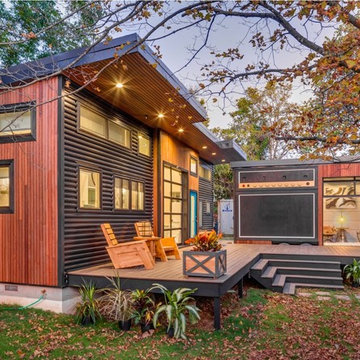
Who lives there: Asha Mevlana and her Havanese dog named Bali
Location: Fayetteville, Arkansas
Size: Main house (400 sq ft), Trailer (160 sq ft.), 1 loft bedroom, 1 bath
What sets your home apart: The home was designed specifically for my lifestyle.
My inspiration: After reading the book, "The Life Changing Magic of Tidying," I got inspired to just live with things that bring me joy which meant scaling down on everything and getting rid of most of my possessions and all of the things that I had accumulated over the years. I also travel quite a bit and wanted to live with just what I needed.
About the house: The L-shaped house consists of two separate structures joined by a deck. The main house (400 sq ft), which rests on a solid foundation, features the kitchen, living room, bathroom and loft bedroom. To make the small area feel more spacious, it was designed with high ceilings, windows and two custom garage doors to let in more light. The L-shape of the deck mirrors the house and allows for the two separate structures to blend seamlessly together. The smaller "amplified" structure (160 sq ft) is built on wheels to allow for touring and transportation. This studio is soundproof using recycled denim, and acts as a recording studio/guest bedroom/practice area. But it doesn't just look like an amp, it actually is one -- just plug in your instrument and sound comes through the front marine speakers onto the expansive deck designed for concerts.
My favorite part of the home is the large kitchen and the expansive deck that makes the home feel even bigger. The deck also acts as a way to bring the community together where local musicians perform. I love having a the amp trailer as a separate space to practice music. But I especially love all the light with windows and garage doors throughout.
Design team: Brian Crabb (designer), Zack Giffin (builder, custom furniture) Vickery Construction (builder) 3 Volve Construction (builder)
Design dilemmas: Because the city wasn’t used to having tiny houses there were certain rules that didn’t quite make sense for a tiny house. I wasn’t allowed to have stairs leading up to the loft, only ladders were allowed. Since it was built, the city is beginning to revisit some of the old rules and hopefully things will be changing.
Photo cred: Don Shreve
www.brandoninteriordesign.co.uk
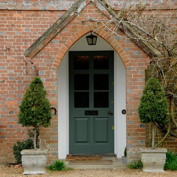
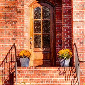
You don't get a second chance to make a first impression !! The front door of this grand country house has been given a new lease of life by painting the outdated "orange" wood in a bold and elegant green. The look is further enhanced by the topiary in antique stone plant holders.
Corralitos, Watsonville, CA
Louie Leu Architect, Inc. collaborated in the role of Executive Architect on a custom home in Corralitas, CA, designed by Italian Architect, Aldo Andreoli.
Located just south of Santa Cruz, California, the site offers a great view of the Monterey Bay. Inspired by the traditional 'Casali' of Tuscany, the house is designed to incorporate separate elements connected to each other, in order to create the feeling of a village. The house incorporates sustainable and energy efficient criteria, such as 'passive-solar' orientation and high thermal and acoustic insulation. The interior will include natural finishes like clay plaster, natural stone and organic paint. The design includes solar panels, radiant heating and an overall healthy green approach.
Photography by Marco Ricca.
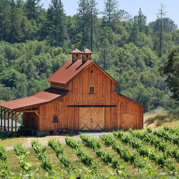
Sand Creek Post & Beam Traditional Wood Barns and Barn Homes Learn more & request a free catalog: www.sandcreekpostandbeam.com
Geräumige Landhausstil Holzfassade Haus in Sonstige
Geräumige Landhausstil Holzfassade Haus in Sonstige
Kleine, Einstöckige Moderne Holzfassade Haus mit brauner Fassadenfarbe und Satteldach in Bordeaux
© Cindy Apple Photography
Mittelgroßes, Dreistöckiges Klassisches Haus mit Backsteinfassade in Seattle
Mittelgroßes, Dreistöckiges Klassisches Haus mit Backsteinfassade in Seattle
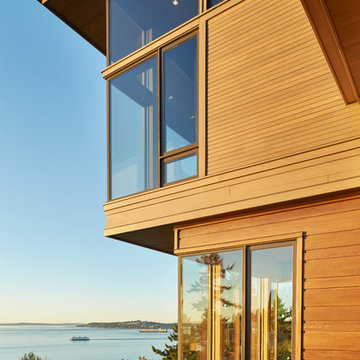
The house exterior is composed of two different patterns of wood siding. The closely spaced T&G siding is for the upper portion of the house, while the more broadly spaced channel siding is used at the base of the house. The house overlooks Puget Sound.
Photos by Benjamin Benschneider
Like us on facebook at www.facebook.com/centresky
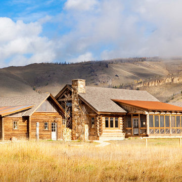
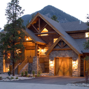
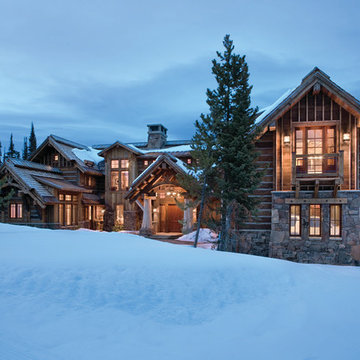
Designed as a prominent display of Architecture, Elk Ridge Lodge stands firmly upon a ridge high atop the Spanish Peaks Club in Big Sky, Montana. Designed around a number of principles; sense of presence, quality of detail, and durability, the monumental home serves as a Montana Legacy home for the family.
Throughout the design process, the height of the home to its relationship on the ridge it sits, was recognized the as one of the design challenges. Techniques such as terracing roof lines, stretching horizontal stone patios out and strategically placed landscaping; all were used to help tuck the mass into its setting. Earthy colored and rustic exterior materials were chosen to offer a western lodge like architectural aesthetic. Dry stack parkitecture stone bases that gradually decrease in scale as they rise up portray a firm foundation for the home to sit on. Historic wood planking with sanded chink joints, horizontal siding with exposed vertical studs on the exterior, and metal accents comprise the remainder of the structures skin. Wood timbers, outriggers and cedar logs work together to create diversity and focal points throughout the exterior elevations. Windows and doors were discussed in depth about type, species and texture and ultimately all wood, wire brushed cedar windows were the final selection to enhance the "elegant ranch" feel. A number of exterior decks and patios increase the connectivity of the interior to the exterior and take full advantage of the views that virtually surround this home.
Upon entering the home you are encased by massive stone piers and angled cedar columns on either side that support an overhead rail bridge spanning the width of the great room, all framing the spectacular view to the Spanish Peaks Mountain Range in the distance. The layout of the home is an open concept with the Kitchen, Great Room, Den, and key circulation paths, as well as certain elements of the upper level open to the spaces below. The kitchen was designed to serve as an extension of the great room, constantly connecting users of both spaces, while the Dining room is still adjacent, it was preferred as a more dedicated space for more formal family meals.
There are numerous detailed elements throughout the interior of the home such as the "rail" bridge ornamented with heavy peened black steel, wire brushed wood to match the windows and doors, and cannon ball newel post caps. Crossing the bridge offers a unique perspective of the Great Room with the massive cedar log columns, the truss work overhead bound by steel straps, and the large windows facing towards the Spanish Peaks. As you experience the spaces you will recognize massive timbers crowning the ceilings with wood planking or plaster between, Roman groin vaults, massive stones and fireboxes creating distinct center pieces for certain rooms, and clerestory windows that aid with natural lighting and create exciting movement throughout the space with light and shadow.
Großes, Zweistöckiges Rustikales Haus mit Mix-Fassade und roter Fassadenfarbe in Minneapolis
Mittelgroßes, Zweistöckiges Klassisches Haus mit Backsteinfassade und brauner Fassadenfarbe in Sonstige
Orange Häuser mit unterschiedlichen Fassadenmaterialien Ideen und Design
5