

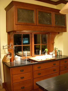
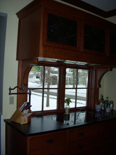
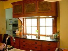
window behind range?
vor 15 Jahren
Hervorgehobene Antwort
Sortieren nach:Älteste
Kommentare (28)
 vor 15 Jahren
- vor 15 Jahren
Ähnliche Diskussionen
Need help with my dining room
Kommentare (5)I think the lamp above the table is too big and hides part of the picture behind, which is a very nice one. I would prefer a more technical lamp, maybe a rail with some spotlights, possibly suspended. A carpet is a good idea, but I would definitly not put it under the table, because then even more objects would be cluttered in only one half of the room, the carpet should instead lie on the left half of the room in front of the table, so that it is not covered with furniture. It should pick up the style of the picture on the wall. My first idea would be a carpet I own myself, it fits quite nice to the picture: Ligne Roset - Menhir And I would prefer a white dining table, because the colour of the chairs would make a better contrast, the dark wood of table and floor is quite heavy....mehrWhat colour/fabric for soft furnishings
Kommentare (19)Hi Ella, first of all, let me say that you have some really nice vintage pieces in your home! If you are planning to keep the light grey rug I would go with a darker shade of grey for the daybed and a lighter shade or a completely different color for the fabric of the sidechair (e.g. like the dark blue in your third photo) in order to create more contrast and give the room a more dynamic feel. You also mentioned a portrait to be hung above the sideboard - maybe the colors of this picture can aslo inspire the fabrics, it's always nice if the same color pops up in different details of a room. I hope this helps in your decision making process and I would love to see the results. Many greetings Anita Goda from Studio Wunderkammer...mehrSpace solutions
Kommentare (25)Hi Nicola, thank you so so much. Its just so nice. So pretty. The good thing is its not a mind bender. I was already thinking something on the lines. But the elements had to fit together. And now it looks they do. What I had not thought at all is the upholstery thing. It’s so nice. Even if I cannot do uphostry , I have gotten the idea now. I would somehow make the back of shelves and the heastbound side of bed same or coordinated, in order to make it kind of cozy niche corner as you have nicely put it. For shelves I was thinking to use a single piece or may a two pieces of 4x4 shelves like IKEA Kalax to creat a kind of partition of about 120 cm As I said I was thinking of similar things but as it comes from an expert I feel very happy. One more thing. For the colors would you recommend the ones I see already in the Sketsch??? Secondly, for the floor in the second / Upper room i was thinking of using small rugs in different colors witha kind of collage ( the pupose being easy maintainece, as a bigger carpet has to be send for professional carpet cleaners or need carpet cleaning machine). Small rugs if one is spoiled is easier to replace , which not easy in case of a bigger one that is wall to wall and heavy. Small rugs are easy to clean an rearrange. Of course under that I can add a light floor matt under these rugs to hold them together.( In both cases what colors , should be good. I mean if I add one piece carpet that would be almost half of the room, which colors should I take) or do you think it will make the rather smaller place look too busy and I should go for a full size carpet? What do you say about that. Thank you so much for your lovely idea and the inpus; in terms of actual work / sketch and your time. Best of regards...mehrTransform Your Home Without a Full Remodel: The Power of Wall Design
Kommentare (0)When people want to refresh a room, they often start by looking at new furniture, lighting, or decorative accessories. Yet the largest visible surfaces in almost every interior are the walls—and changing them can have a greater impact than replacing everything else in the room. The right combination of color, texture, and surface finish can make a room feel brighter, larger, warmer, calmer, or more sophisticated. It can also highlight existing furniture, improve awkward proportions, and give an older interior a completely different character. A successful transformation does not always require a complete remodel. With thoughtful planning, suitable materials, and careful preparation, wall design alone can dramatically change how a home looks and feels. Begin With the Room, Not the Paint Color One of the most common mistakes is choosing a color from a small sample without considering the room where it will be used. The same shade can look very different depending on natural light, artificial lighting, flooring, furniture, and surrounding colors. Before making a final decision, consider several important questions: How much natural light enters the room? Which direction do the windows face? What colors are already present in the flooring and furniture? Should the room feel brighter, warmer, larger, or more intimate? Is there an architectural feature worth emphasizing? How will the room be used throughout the day? A warm beige may look light and welcoming in a sunny room but appear heavier in a darker space. A cool gray can balance warm wood flooring, yet it may feel uncomfortable when combined with other cool surfaces. For this reason, it is wise to test larger color samples directly on different walls. Observe them in the morning, afternoon, evening, and under artificial light. This simple step can prevent disappointment after the entire room has been painted. Small Rooms Do Not Have to Be White White is often treated as the only safe choice for a small room. It can certainly reflect light, but it is not the only color capable of creating an open and comfortable atmosphere. Soft shades of beige, sand, gray, green, or blue can also make a compact room feel spacious. The key is to avoid overly harsh contrasts between the walls, ceiling, flooring, and large pieces of furniture. A low ceiling may appear higher when it is painted lighter than the walls. In a long, narrow room, using a slightly darker tone on the far wall can make that surface appear closer and create more balanced proportions. Dark colors do not automatically make every room feel smaller. When used selectively, they can add depth and help correct an awkward layout. A darker wall behind a bed, sofa, or dining table may give the room a clearer focal point without overwhelming the space. Use Accent Walls With a Purpose An accent wall can add character and create a visual center, but it should be chosen intentionally. Selecting a wall simply because it is the first one visible from the doorway does not always produce the best result. Good candidates for an accent wall include: the wall behind a sofa; the headboard wall in a bedroom; the wall behind a dining table; a fireplace wall; an architectural niche; the background of a home office; a wall displaying artwork or shelving. The accent color can be repeated in smaller details such as cushions, artwork, curtains, or decorative objects. This helps the room feel connected and prevents the accent wall from looking isolated. In most interiors, one carefully selected feature wall is more effective than several competing colors. If too many surfaces demand attention, the room can quickly feel visually crowded. Paint or Wallpaper? Both paint and wallpaper offer valuable design possibilities, but they create different effects. Paint provides flexibility and can be updated relatively easily. It works especially well in modern, understated interiors where furniture, artwork, and lighting should remain the primary focus. Wallpaper introduces pattern, depth, and texture. Modern wallpaper is available in everything from subtle textile-inspired finishes to large botanical, geometric, and artistic designs. A patterned wallpaper often works best when it is used selectively rather than throughout the entire room. In a bedroom, wallpaper can define the wall behind the bed. In a dining area, it can create a distinct visual zone without requiring a physical divider. Textured wallpaper can also add warmth to an interior that otherwise contains many smooth, minimal surfaces. Paint and wallpaper do not have to be competing choices. A decorative wallpaper can be used on one wall while the surrounding surfaces are painted in a coordinated neutral tone. Surface Preparation Determines the Final Result Even the highest-quality paint or most expensive wallpaper cannot hide every problem underneath it. Cracks, holes, old adhesive, loose coatings, and uneven surfaces often remain visible after the new finish has been applied. Before decorating begins, the walls should be inspected carefully: Is the existing surface stable? Are there cracks or loose areas? Has old wallpaper been removed completely? Do holes and uneven sections need to be filled? Is sanding required? Does the surface need a primer? Are there signs of moisture or mold that require further investigation? Walls exposed to strong side lighting require particular attention. Light coming from large windows or wall-mounted fixtures can make even small imperfections noticeable. Smooth, single-color finishes also reveal more surface defects than textured wallpaper. Primer is another important part of the process. It helps create a more evenly absorbent surface and improves adhesion. Without the correct primer, the finished wall may develop uneven patches, differences in sheen, or visible color variations. The quality of the preparation is often what separates a quick cosmetic update from a finish that continues to look good for years. Match the Finish to the Room The sheen of the paint affects both appearance and practicality. Matte finishes create a calm, elegant look and reflect less light. They can also make minor surface imperfections less noticeable, which makes them suitable for many living rooms and bedrooms. Hallways, staircases, kitchens, and children’s rooms may benefit from more durable, washable coatings. These areas are more likely to develop marks, stains, and signs of frequent contact. A more resistant surface is easier to maintain and can remain presentable for longer. Glossier finishes reflect more light and can make a color appear more intense. However, they also emphasize uneven surfaces. They should therefore be used on well-prepared walls or as a deliberate decorative feature. It is worth choosing the paint based not only on its color but also on how the room will be used in everyday life. Create Balanced Areas in Open-Plan Interiors Color can help organize an open-plan home without building additional walls. A dining area may be defined with a slightly darker tone, while the surrounding living space remains lighter. A home-office corner can be framed with a coordinated color that visually separates it from the rest of the room. These transitions do not have to be dramatic. Two related shades from the same color family can create enough contrast to establish different zones while preserving a cohesive design. Geometric color sections, sometimes called color blocking, provide another way to highlight furniture or architectural details. This technique can look modern and distinctive, but it requires precise planning and clean lines. Irregular edges are immediately noticeable when strong color contrasts are used. Consider the Entire Interior A wall color should not be chosen in isolation. Flooring, doors, window frames, furniture, textiles, and lighting all contribute to the final result. Warm wood floors generally work well with natural, earthy colors. Stone, concrete, and metal surfaces may benefit from warmer wall shades that prevent the room from feeling too cold. Strongly colored furniture often looks better against a quieter background. Lighting also plays a major role. Warm artificial light can make beige, cream, and muted red tones appear richer, while cool lighting may emphasize gray or blue undertones. The color temperature of bulbs should therefore be considered before the wall finish is finalized. The most successful interiors are not necessarily those with the most dramatic colors. They are the ones in which the individual elements support one another. Choose a Timeless Base Interior trends can provide inspiration, but walls usually remain unchanged for several years. Building the entire design around a short-lived trend may therefore lead to another renovation sooner than expected. Warm whites, natural beige, muted gray, soft green, and restrained blue tones offer a flexible foundation. They can work with different styles of furniture and allow the room to evolve over time. More distinctive trend colors can be introduced through an accent wall, wallpaper, artwork, or smaller decorative elements. These features are easier to update later than an entire room. The most important question is not whether a color is currently fashionable. It is whether it suits the light, proportions, function, and personality of the room. Follow the Right Renovation Sequence Good planning prevents newly finished surfaces from being damaged or covered in dust during later work. A typical sequence may include: Measure the room and plan the design. Remove furniture or protect it carefully. Remove old wallpaper and unstable coatings. Repair cracks, holes, and damaged areas. Fill and sand uneven surfaces. Clean and prime the walls where necessary. Finish the ceiling. Apply wallpaper or paint to the walls. Complete edges and detailed areas. Allow sufficient drying time. Remove protective materials carefully. Ventilate and clean the room before replacing furniture. If several rooms are being renovated, material quantities and drying periods should be planned in advance. A logical schedule can reduce disruption and prevent parts of the home from remaining unusable longer than necessary. A Successful Transformation Combines Design and Craftsmanship Effective wall design begins with a creative idea, but it depends on much more than selecting an attractive color. Lighting, room proportions, surface condition, materials, and application methods all influence the final appearance. In many homes, carefully prepared walls, a balanced color palette, and one thoughtfully designed feature surface can create a greater transformation than replacing the furniture. However, the visible result will only remain attractive when the less visible preparation work has been completed properly. Homeowners planning interior renovation work in Wuppertal and the surrounding area can find more information about wall preparation, painting, wallpapering, and interior finishing from Innenmeister. With the right choices and careful execution, wall design can become more than a cosmetic update. It can improve the atmosphere, functionality, and long-term comfort of the entire room....mehr- vor 15 Jahren
- vor 15 Jahren
- vor 15 Jahren
- vor 15 Jahren
- vor 15 Jahren
- vor 15 Jahren
- vor 15 Jahren
- vor 15 Jahren
- vor 15 Jahren
- vor 15 Jahren
- vor 15 Jahren
- vor 15 Jahren
- vor 15 Jahren
- vor 15 Jahren
- vor 15 Jahren
- vor 15 Jahren
- vor 15 Jahren
- vor 15 Jahren
- vor 15 Jahren
- vor 15 Jahren
- vor 15 Jahren
- vor 15 Jahren
- vor 15 Jahren
- vor 15 Jahren
- vor 15 Jahren


Gesponsert
Laden Sie die Seite neu, um diese Anzeige nicht mehr zu sehen
boxerpups