

backsplash question
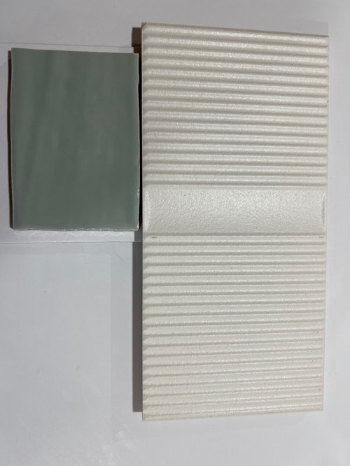
Hi, we’re going to have one backsplash on one wall of kitchen and another on the other wall. One is glossy ceramic and I’d like the other neutral and textured. Any rules to follow on size of tiles and general compatibility with one another? These are the tiles we’re thinking of. The pale green comes in varied sizes and the white is 8x16. Thanks!
Kommentare (51)
 vor 3 Jahren
Though the texture play is fun, I wouldn't go with something that textures for a backsplash except maybe on a small section which won't get as dirty, i.e. coffee nook or something of the sort.
I have one large slab of quartz and the ease of cleaning is so convenient. Just some food for thought
Amber Patel
Ursprünglicher Verfasservor 3 JahrenThank you Fey! Yes, I wondered the same which is why I avoided some of the more intricate textured splash. Thank you for confirming. We would definitely put this on the wall opposite the oven range and sink.
Amber Patel
Ursprünglicher Verfasservor 3 JahrenMaybe textured isn’t the right description. A lot of those give me the heebie jeebies b/c they’re unpleasant for me to touch. Maybe 3D is a better descriptor. Our kitchen is gutted at the moment but we’ve picked white shaker cabinets (upper and lower) and and white Carrera quartz top with very little marbling. Tile floors that look like wood.
Amber Patel
Ursprünglicher Verfasservor 3 JahrenThose 8x16 tiles are broken into 4 “parts” - two smooth sections and two ridged sections so they appear as 4 pieces together (according to the description!)
 vor 3 JahrenZuletzt geändert: vor 3 Jahren
Amber, but how big is the backsplash area you're tiling? do you have a large open area?
normal backsplashes are 18-20" from countertop to cabinet. using 16" is going to leave you w/small cuts.
do you have a picture of how that tile looks installed?
with a carrara top and classic white shaker, I'm not sure if that's the best choice. Looks like more of a modern style or mcm style would fit that a bit better.
if you want 3d, try looking at the Nabi Harliquin
https://www.tilebar.com/nabi-harlequin-natural-white-ceramic-tile.html
i have a sample of it. comes in many colors
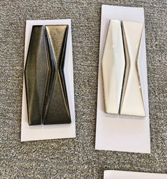
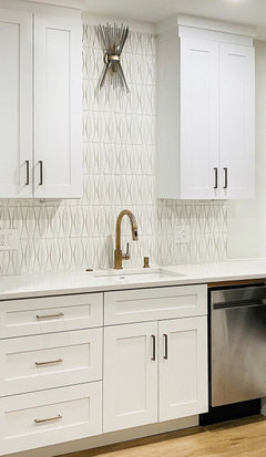
or, maybe the Jewel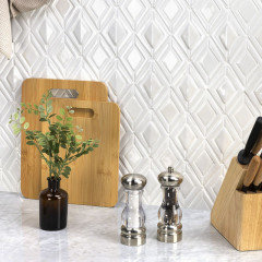
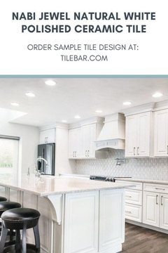
Nabi Argyle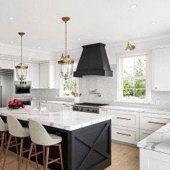
this one is on tilebar too, I forget the name. is this the style of your kitchen?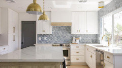
the Maya green glass is also pretty (if you wanted the green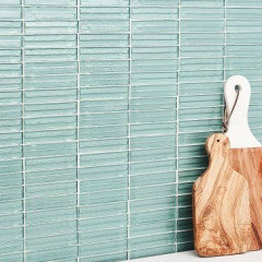
Amber Patel
Ursprünglicher Verfasservor 3 JahrenAh, ok. Yes, the cabinets are 18” above the countertop. What’s mcm style?
https://www.tilebar.com/collection/tile-mosaic-collections/division.html
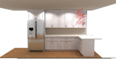
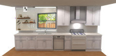
The pic is where I’d put this tile. The opposite side of of the kitchen would have the other tile. The ceiling is 8’. And the last curved shelf and cabinet (which I scratched out) is being replaced by three wooden floating shelves. We’d run the tile to the overhang and to the ceiling
Amber Patel
Ursprünglicher Verfasservor 3 JahrenThe wooden shelves would extend to the end of the base cabinet (not too the overhang)
- vor 3 JahrenZuletzt geändert: vor 3 Jahren
Oh ok,, I've seen this one. the way you had it laid out looked like your were going vertical
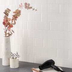
I guess it can go like this too. which way were you thinking?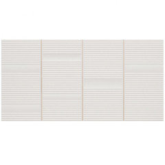
it you get 16" this way, (figure 16.5 with grout) that leaves you w/1.5" under the cabinet area to cut. I think that would be fine.even the other way, you'd still have the same cut.
instead of the offset, you can lay it in this stacked pattern.
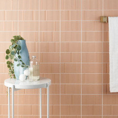
did you see the Enigma tile? (they hve white)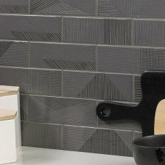
so where do you want the white and where is the green going? do you ahve a layout of the kitchen? Amber Patel
Ursprünglicher Verfasservor 3 JahrenSorry for the confusion in the layout! Yes, def horizontal. Does it matter if it’s staggered or stacked when it gets to the end of the wall? The grout will be the same color
Amber Patel
Ursprünglicher Verfasservor 3 JahrenZuletzt geändert: vor 3 JahrenThis is opposite side where the green will go to the ceiling. The top upper left cabinet is coming out and that will be just wall.
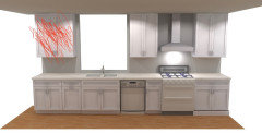
Amber Patel
Ursprünglicher Verfasservor 3 JahrenAnother perspective (if you’re looking at the kitchen from the dining room
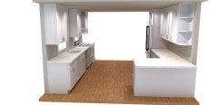
 vor 3 Jahren
Your kitchen looks like it will be very nice. That green tile gives me bathroom vibes, though. Maybe something less “washed out” looking would be better?
- vor 3 Jahren
Amber, after looking over your rendition pics, I came up w/some other alternatives.
Lots of pictures below trying to explain a few diff things that I caught. hope it isn't too confusing.
first,I like this tile
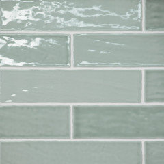
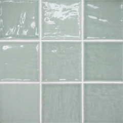
if you're taking out that left cab, then for sure, put up two floating shelves. (I know you're doing it on the other side, but why are you removing it from the window side?
I'd run the tile all the way up, and all the way up around the vent hood.In fact, want to see my rendition? (iimagine it w/your green tile)
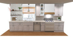
I'd do the floating wood shelves, woven wood blind w/pendant, and instead of the SS chimney style hood, I'd prob have one made to match the cabinetry and trim it out in the same wood as the shelving. I gave you a glass door, but that's up to you.
here, this is where I got most of it. if you used the 5x5 tile it would look like this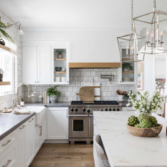
Another visual shoing the open shelves next to window, and the cabinet over by the peninsula. (and very nice pendants and window treatment that matches the stools)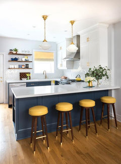
With mine, I had a vent hood made to fit around my insert. I trimmed it out in the same walnut that's around my window and my shelves.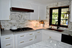
Do you like the SS chimeny style hood better?
Just something to consider. the inserts are around $700 for a 36" range top.
or, paint the chimney hood to match your cabinets. this looks so much better than the SS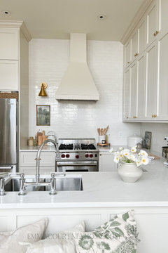
Exactly where do you want to mix and match your tile? how exactly were you going to use both?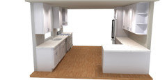
I see no obvious delineation where using two tiles will work.
Do you have another space where you could meld the diff tiles?
Or did you want to use one on one side and the one on the other? (that would be a no)
In my own space I have a marble tile as a backsplash,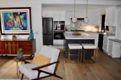
andoff to the left, a little coffee bar area that I did a completely diff tile with my walnut shelving.
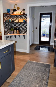
Do you have any other spot you could use it? maybe over in the dining area? or a bar area?
Back to your peninsula. you said you removed the cabs and are doing shelving?something like this?
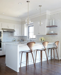
It's a little diff because this shot has the window on this side. you would only be removing the one end cabinet?
what if you shortened all of those uppers on that side and did a single long shelf to the end of the peninsula?
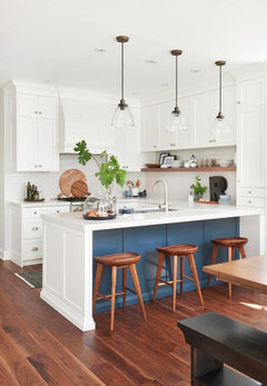
Pendants too
Both of these are peninsulas by the window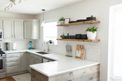
could you move your peninsula to the left side? is that an option?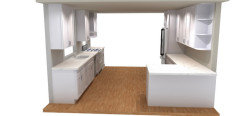
Reaching your open shelves w/the peninsula in the way could be difficult.You could opt for this instead, and do the shelves on the window side.
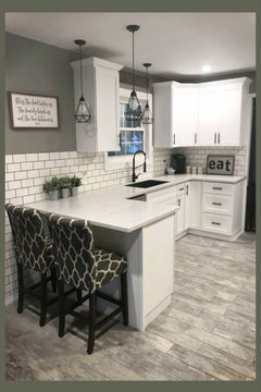
on the window side, you could do partial upper cabs( they sit higher) and one shelf beneath those. (and do the shelves on the other side)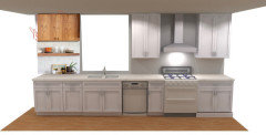
Peninsula side- You could put the uppers back in, but make them glass front like shown here: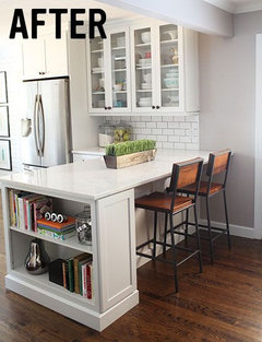
Or like this one. I like the enclosed shelving like they did here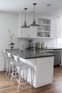
Or like this one. a wood veneer on the interior just takes the look up a notch.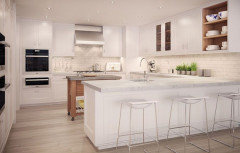
Where do you plan on ending the tile on this side? you going to take it all the way out to the edge? (make sure you get bullnosed tile for these end pieces. Or you could do a Schluter Jolly edge)
this one is a bullnosed edge tile that stopped at the upper cabinet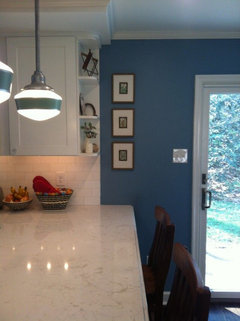
Personally I prefer this option. take the tile all the way to the countertop edge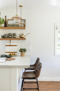
lord have mercy, don't EVER finish off the edge w/vertical tile like shown here.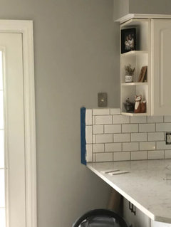
Amber Patel
Ursprünglicher Verfasservor 3 JahrenWow Beth, this is amazing - thank you so much for all the thought and fresh ideas you put into my kitchen!
A few answers to your Qs and some background. Our before kitchen is so dark with very little counter space to do anything. At ANY time of day you need to turn the lights on to do anything. There are no windows. Unfortunately that opening in the rendering is looking into the living room. (We’re recessing the ceiling and adding a skylight as well). The kitchen is locked between the dining room and a wall that is part of the entryway. The space is small so we wanted to open it up and give it some breathing room. Here are some before pics of the area: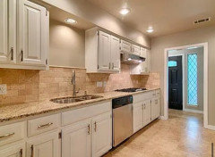
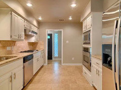
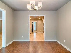
Amber Patel
Ursprünglicher Verfasservor 3 JahrenWe’re obviously taking the wall down between the kitchen and dining room. And we’re eating into the dining room a bit.
Your point about the shelves being unreachable is well-taken. I didn’t want to put them on the opposite space b/c I was hoping for some open space for food prep. Right now I have a cabinet in the way of prepping food and felt having an open space would be better. Shelves there would actually be useful - having a bowl or dish within hands reach of food prep would be good, but I wouldn’t want to do it at the expense of having open and free space.
Amber Patel
Ursprünglicher Verfasservor 3 JahrenI do like the cabinet hood but I think it would just feel a bit heavy in our small space. In fact, we’ve decided to relegate the microwave to the pantry to have that area open. Here’s the hood we purchased which we think will feel more streamlined than the traditional hoods
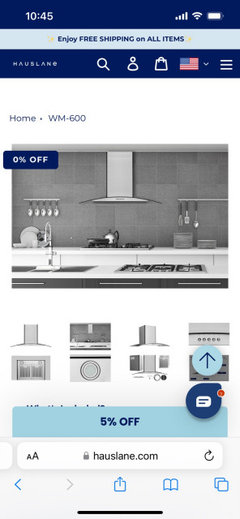
- vor 3 JahrenZuletzt geändert: vor 3 Jahren
so, you're removing the soffitt? can you open up the area over the sink into the other room?
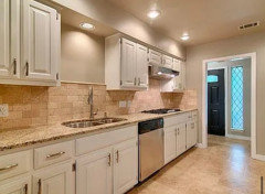
a pass-through w/a bar overhang on the other side?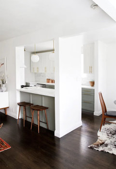
these are all pass throughs. can you manage any of these?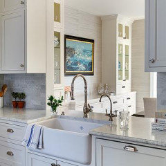
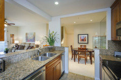
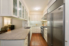
if you can't open a pass-thru, then I would do something like this, keeping the uppers and doing the shelves over the sink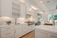
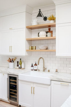
absolutely put in some sconces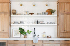
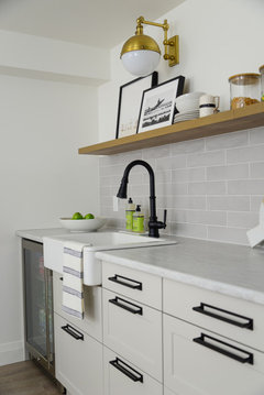
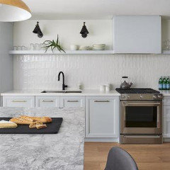
skylight is a great idea. it will make a huge differencegalley style no window
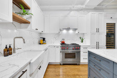
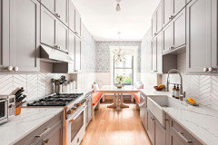
https://www.apartmenttherapy.com/galley-kitchen-design-ideas-to-steal-for-your-remodel-238988 Amber Patel
Ursprünglicher Verfasservor 3 JahrenRe mixing a matching tiles 😬
I was thinking of doing the easy to clean green on the sink/range side (running up to the ceiling) and the white on the opposite wall (also running up to the ceiling and extending to the edge of the overhang). These two sides of the kitchen don’t meet anywhere. (There’s a doorway to the left of the fridge that leads to the laundry area and master bedroom). Is it terrible to have one backsplash on each side?- vor 3 JahrenZuletzt geändert: vor 3 Jahren
Is it terrible to have one backsplash on each side?
Yes. lol.
for your style kitchen, yes. I wouldn't do it.
can you do it in the laudry room or some other type of of bar or bathroom?
But just wait. tile is the last thing to go up. why not get everything installed first, and then evaluate where the tile is going?right now I'd be more concerned about a poss pass through, or floating some shelves, or rearranging those shelves, removing the bulkhead, and figuring out where your lighting is going to go. I assume you're doing canned lights? I'd still put in some sconces over the shelves, or if you aren't opening up a passthrough, I'd do a sconce or a pendant over that sink
Amber Patel
Ursprünglicher Verfasservor 3 Jahren(There’s a large entryway from the living room into the dining area that I think moving the peninsula to the left side would “block” for lack of better word)
- vor 3 JahrenZuletzt geändert: vor 3 Jahren
no pass through, and you want the open shelves, how about this look? just run it all the way across. don't forget sconces
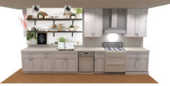
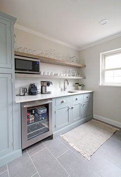
This is nice because you can do you're built in microwave up here.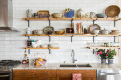
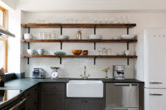
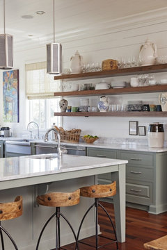
ignore the cabinets on either end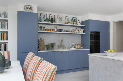
here's a peninsula area w/some shelves, sconce. your SS vent hood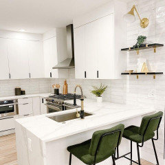
another vent hood next to open shelves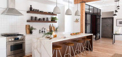
Amber Patel
Ursprünglicher Verfasservor 3 JahrenOh yes - definitely doing the pass through but wouldn’t be able to accommodate stools on that side (would be too narrow a walkway between the sofa and stools). Soffits are coming down too. Canned lights yes. Microwave is in pantry which is in the hallway behind the fridge bizarrely. We did talk about doing pendant lights and will definitely add sconces - so pretty.
Ok will wait for backsplash last! 😊
Thank you again so much for your thoughts!!
- vor 3 Jahren
I like the very pale green and the pale green glass tiles Beth H suggested.
I like Beth H's photo with white tiles and the green chairs at the counter.
Please get chairs that are easily cleanable if you have children.
I like the gold wall light fixture too, but I myself would not get a fixture where I can see the bulb, that would give me a headache. Translucent globes or covers of some sort are good for me.
Green goes well with food, and is very restful on the eyes and will harmonize with most colors.
However, please think about your dishes and accessories and if green will play nicely with your colors.
While tiles, white textured tiles and marble tiles always look great too.
People may say it is too much white with white cabinets, but you will most probably have non-white things out on the counters, for example, fruit ripening, a plant or flowers, cutting boards that are drying.
I have 3 white ceramic crocks with stainless and wood silicone tipped utensils (the silicone is so that they don't scratch the pans) and they are all different colors.
And no, I didn't do that on purpose, I am not that clever.
They were purchased over the last 30 years, whatever was on sale at Sur La Table.
I don't even need that many utensils now, they just look so lively and happy, that multicolored garden of scoops and spatulae on my counter.
Sorry, I digress.
Amber Patel
Ursprünglicher Verfasservor 3 JahrenIf I do floating wooden shelves opposite each other on either side, do I put the same sconces on either side? I don’t need to create a mirror image. But…
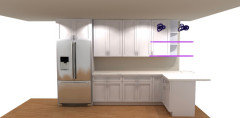
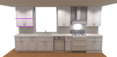
Amber Patel
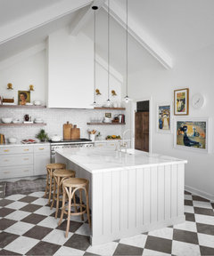
Ursprünglicher Verfasservor 3 JahrenLike so…except this is symmetrical on same wall. Mine would be opposite
- vor 3 JahrenZuletzt geändert: vor 3 Jahren
maybe do two on one side, one on the other?
perhaps on the one sconce side, stager the shelves, on the penin side, stack them?
Or, on this side you could just get some coordinating pendants. that might kill two birds w/one stone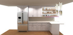
depends what kind of sconces you're talking about. do you have anything in mind?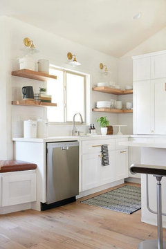
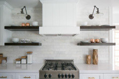
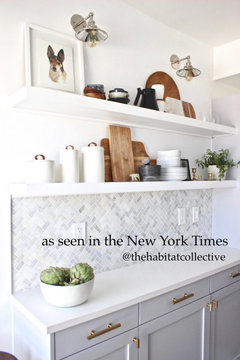
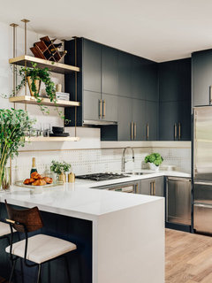
You could do sconces on the fridge side and do a pendant on the sink side.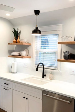
lots of diff waysYou sure you want that type of range? get the one w/no back to it, like this one
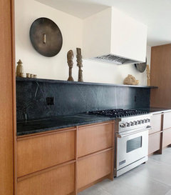
and I still think a vent hood like this or some of the others would look better. Amber Patel
Ursprünglicher Verfasservor 3 JahrenIt’s a slide in range not a freestanding with a back to it. The cabinet makers did the rendering so didn’t care too much about those types of details. 😏
I’m trying to avoid a pendant in the pass through and on the peninsula b/c there will be a chandelier (haven’t picked it yet!) in the now smaller dining room just right behind. Thought the sconces would be a more elegant and simple touch. I like the smaller ones…I kinda like the milk glass looking ones. I’ll see if I can find them again. Too barbershop though?- vor 3 JahrenZuletzt geändert: vor 3 Jahren
I like the no back stove top.
here it is w/a hood I don't really like,
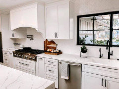
Place this hood with the above picture. much better.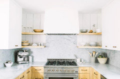
love this look w/the shelves instead of your cabs. (this is MSI quartz)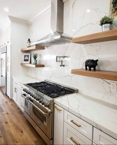
I adore this one! imagine it's your white, w/either this vent hood in the same white, or this wood. and w/the green tile you want, this walnut wood would really take your design up a few notches. (see the tile off to the right side around the window?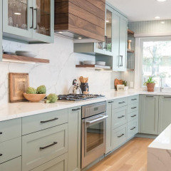
do some shorter cabs and get matching wood off to either side, under cabinet lighting. This is stunning ^ - vor 3 JahrenZuletzt geändert: vor 3 Jahren
no ^
not suitable above floating shelves, and really doesn't go w/your white shaker style.
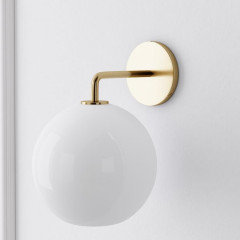
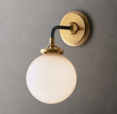
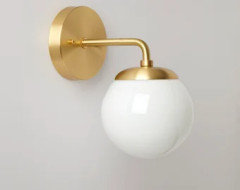
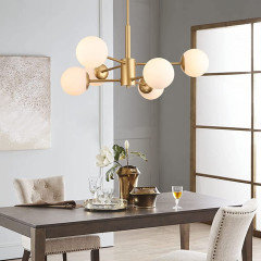
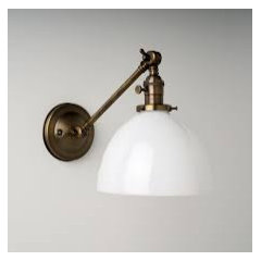
what about the clear glass?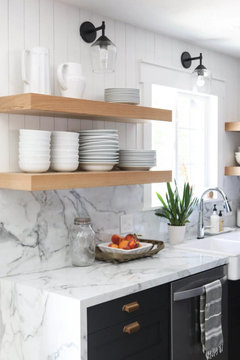
Amber Patel
Ursprünglicher Verfasservor 3 JahrenI like all those too! Don’t love the clear glass… also open to a white sconce cover if we use green tile throughout
Amber Patel
Ursprünglicher Verfasservor 3 JahrenI guess things like cabinet and drawer pull color will need to match sconce metal?
- vor 3 JahrenZuletzt geändert: vor 3 Jahren
I like that Young House love sconce
it's fine to mix and match metals. black/gold silver/gold black/silver I've even seen all three.if doing all gold, then you should try and stay as close to the shade as you can
 vor 3 Jahren
Wait to make the final backsplash tile decision. Do EVERYTHING else, especially lighting and then come back for suggestions. I think two different tiles in your small kitchen won’t work. I like the soft green that Beth posted the best, but wait, wait, wait!
Houzz is flooded with bad tile selections that were made too early. Lots of great ideas from @Beth H regarding your shelves, cabinets, range and hood. Install everything and then take a breath. Your ideas may change after the their work is done.
Amber Patel
Ursprünglicher Verfasservor 3 JahrenI’m digging this one! It’s bigger than the first link I posted and I like that it can be angled!
https://www.lumens.com/bella-adjustable-wall-sconce-by-huxe-MTHP377157.html?q=Bella sconce&dwvar_MTHP377157_AttrValue1=Aged Gold Brass with Black#q=Bella sconce&tileIndex=2
- vor 3 Jahren
I am using the same marin tile from bedrosian for my bathroom but in the light beige color and in the 2.5x5’s. i love them they are so pretty. i bought a box to stage to make my final desicion as a tiny sample was too hard to tell from.
Amber Patel
Ursprünglicher Verfasservor 3 Jahren@kami, I really can’t decide between the aloe and the misty blue - they’re all so pretty! Glad you love them, thanks for sharing!
- vor 3 JahrenZuletzt geändert: vor 3 Jahren
Oh Beth H-
That kitchen with the black cabinets and white counters with waterfall and suspended wood open shelves and dotted white backsplash and plants is downright sexy!!
I don't know why I feel that way, and who talks about kitchens being sexy??
(Especially at my age and stage!!)
Perhaps it was the juxtaposition of opposites-
the black and white colors,
the modern waterfall counter and the wooden shelf but the modern hanging hardware,
stainless steel appliances but the exuberant live foliage and beautiful wood with superb craftsmanship on the chair backs.
Maybe the tension of all those opposites is what evoked that visceral response?
I am mostly a traditionalist in decor, but I would take that kitchen with a real hood vent and lots of storage any time!
- vor 3 JahrenZuletzt geändert: vor 3 Jahren
I like Beth H's suggestions for translucent globe fixtures.
Flush mounted globes have a place somewhere, but I am not sure where.
I don't care for light fixtures that have a metal shade perched over a transparent or translucent bulb cover.
Somehow it reminds me of an insect with wings over the thorax and abdomen.
Now these look like bees to me, of course they are outdoor fixtures.
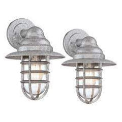
Amber-Your Bella Sconce seems rather angular or modern.
It looks like something for an office, or hallway rather than a kitchen.
As for your concern about it being able to be "angled," the kitchen should have ambient light from overheads, either a ceiling fixture or fixtures or recessed or can lighting, pendant lighting over your island peninsula if it needs it, wall mounted fixtures at your sink, and depending on the previously mentioned lighting and your needs, under counter lighting.
Also consider your personal needs and that of who is living there.
For example, as we age, we need more light. A 50 year old needs almost twice as much light as a 30 year old to do the same task.
Realistically, are you going to reach up to a light fixture installed on the wall 6-7 feet up to adjust it, especially in a kitchen when your hands may be wet or soiled with food?
Is that something you want your children to see you do, when they may not understand, and they will try it and inadvertently stick their little hands inside the fixture and risk getting an electric shock? I know you'll watch them, but everyone uses the bathroom some time.
If you need more light on the sink, get lights over the sink in the ceiling or on the wall in front of the sink, and if you need more elsewhere, get them too.
Don't apologize for your needs.
You can still be well -lit and get something nice looking.
Hooray for the modern age, antibiotics and feminine hygiene products.
Okay, I went too far...
Just try not to have those strip lights that some people put on the walkways to their front door that make it look like an airport runway :)
Amber Patel
Ursprünglicher Verfasservor 3 JahrenThanks Loobab! I picked a different one altogether and just one. Our kitchen is small and already upgrading from the 6 canned lights we initially had to the 4 they put in the recession has made a world of difference. The additional sconce, recessed kitchen sink light and UCL on the backwall will be plenty I think. The guy at Lamps Plus agrees. :)

Laden Sie die Seite neu, um diese Anzeige nicht mehr zu sehen
Beth H. :